

Neo-Traditional Tattoo: The Design Consultation Checklist for Line Hierarchy, Decorative Framing, and Controlled Color
Introduction: Beyond the Style Label
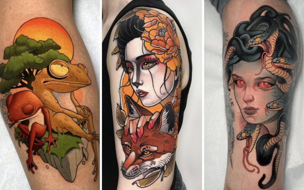
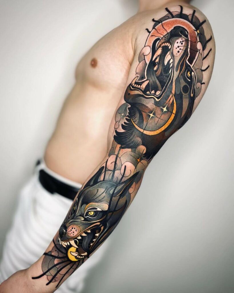
Neo-traditional is often mistaken for a style that simply adds more color and more ornament. In reality, it is a discipline of controlled decisions. The difference between a tattoo that reads as a confident illustration and one that collapses into visual noise comes down to three pillars: line hierarchy, decorative framing, and controlled color. This checklist is designed for your consultation, whether you are the artist or the client, to ensure every design decision is intentional.
1. Line Hierarchy: The Backbone of Readability
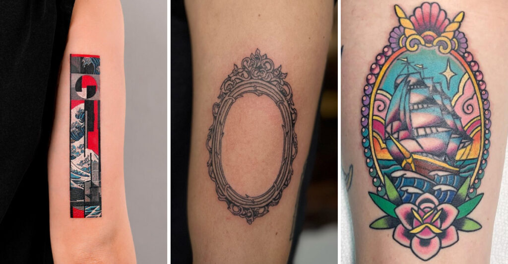
Line hierarchy determines what the eye sees first. In neo-traditional, the primary subject must be anchored by bold, consistent outlines, while secondary elements recede with thinner or broken lines. During your consultation, ask these questions:
- What is the focal point? The main subject (e.g., a bird, a skull, a flower) should have the heaviest line weight, typically 5-7 mm for a large piece, but scale relative to the design.
- Are there secondary lines? Use 3-5 mm lines for details like petals or feathers, and 1-2 mm for fine accents (e.g., stippling or hairline cracks).
- How do lines interact with shading? In neo-traditional, linework often carries the shading—think of classic woodcut or engraving. Decide if you want crosshatching, stippling, or solid black areas.
Checklist for line hierarchy:
- Identify the primary subject and assign it the heaviest line.
- Define secondary elements with medium weight.
- Use fine lines only for texture, not for structural outlines.
- Ensure all lines are parallel or flowing consistently—no random breaks.
- Ask to see a black-and-white line draft before color is added.
2. Decorative Framing: The Border That Makes or Breaks
Neo-traditional often uses decorative framing—ornate borders, filigree, geometric dividers, or botanical corners—to give the piece a cohesive shape. But framing is not just an afterthought; it must be planned in the same session as the subject.
Key considerations:
- Does the frame complement or compete? The frame should be lighter in visual weight than the subject. If the frame has heavy blackwork, it will pull attention away.
- What shape works for the body placement? A circular frame suits a shoulder cap, a rectangular frame fits a flat area like the chest or back, and a teardrop frame follows a calf or forearm.
- How does the frame interact with negative space? Neo-traditional thrives on balanced negative space. The frame should define that space, not fill it entirely.
Framing checklist:
- Choose a frame style: ornamental, geometric, botanical, or architectural.
- Decide on line weight for the frame—usually thinner than the main subject.
- Plan how the frame will sit on the body—does it wrap around a curve?
- Ensure the frame has at least one point of connection with the subject (e.g., a stem that touches the border).
- Ask for a mock-up of the frame alone to see how it flows.
3. Controlled Color: Less Is More
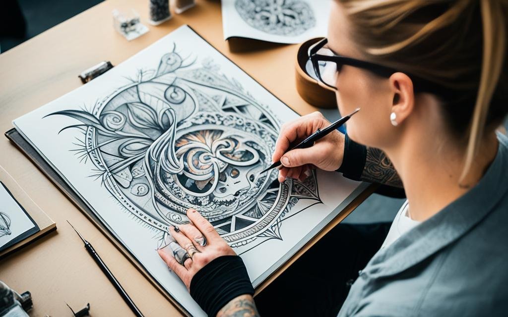
Color in neo-traditional is not about saturation; it is about controlled contrast. The best neo-traditional pieces use a limited palette—often 3-5 colors—and rely on black shading to create depth. During your consultation, discuss:
- What is your color story? Choose a dominant hue (e.g., deep red, emerald green, or mustard yellow) and one or two accent colors. Avoid rainbow effects.
- How will black be used? Black is a color. Decide where black will be the primary shading tool—usually in the shadows and under the subject.
- What about skin tone? Realistic caveat: colors like yellow and pastel pink fade faster on darker skin. Ask your artist for a color test patch if you are unsure.
Color checklist:
- Limit the palette to 3-5 colors.
- Define the shadow color (usually black or a dark brown) and the highlight color (skin tone or white).
- Ask to see a color mock-up with the exact inks to be used.
- Discuss how the colors will age—some pigments spread over time.
- Make sure the color does not overpower the linework; lines should always be visible.
4. The Consultation Session: A Step-by-Step Checklist
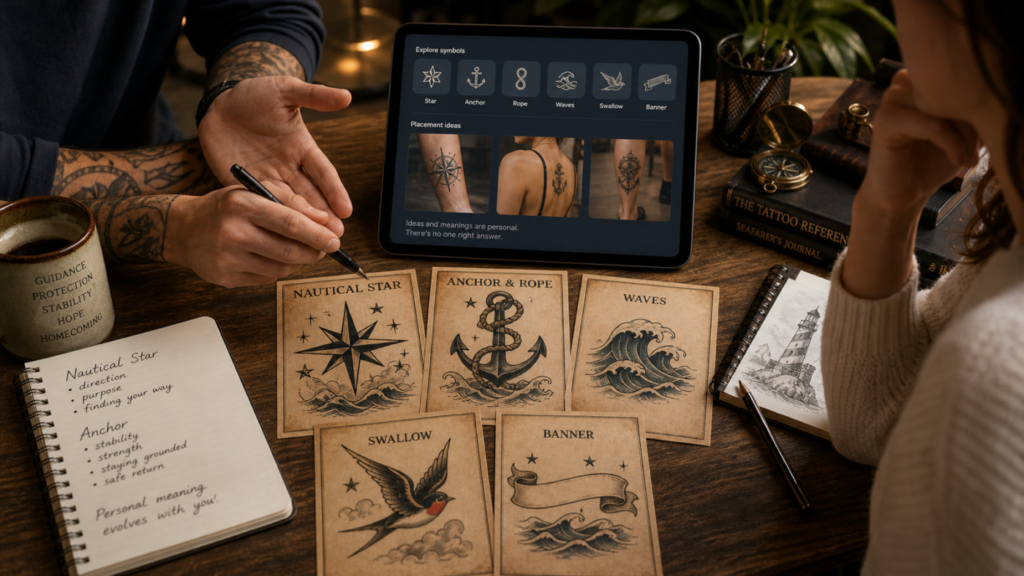
Whether you are a client or an artist, use this session flow to keep the design on track.
For the Client:
- Bring reference images of neo-traditional tattoos you like, but be ready to explain why you like them (line weight? color? composition?).
- Ask to see the artist’s portfolio specifically for neo-traditional—not just any style.
- Discuss placement and size: larger pieces allow for finer details, but they also require more sessions.
- Ask about the artist’s approach to line hierarchy and framing—do they have a signature? Are they flexible?
- Request a final design preview before the appointment; do not rush into the needle.
For the Artist:
- Start with a black-and-white line drawing to establish hierarchy.
- Add the frame only after the subject is approved.
- Present a color palette that respects the skin tone and the design’s mood.
- Explain how the tattoo will age: bold lines hold, fine lines blur, colors fade.
- Set realistic expectations about the number of sessions needed.
5. Booking and Safety Questions

Before you book, ask these practical questions—they are as important as the design itself.
- What is the studio’s hygiene protocol? Look for autoclave sterilization, single-use needles, and fresh gloves.
- Does the artist have experience with your skin type? Ask for healed photos on similar skin tones.
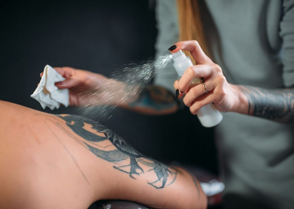
- What is the aftercare routine? Neo-traditional tattoos have heavy black areas that need careful moisturizing to prevent scabbing.
- Can you see a mock-up of the design on your body? Many artists use stencils or digital previews.
6. Common Pitfalls to Avoid
- Too many colors—this turns neo-traditional into a cartoon.
- Thin lines everywhere—this loses the bold contrast that defines the style.
- Overly complex frames—they can distract from the subject.
- Ignoring the body’s natural contours—a flat design will not flow.
- Skipping the black-and-white draft—you need to see the structure before color.
7. The Role of Other Styles in Neo-Traditional
Neo-traditional borrows from many traditions. A good designer knows how to integrate elements from Japanese traditional (waves, chrysanthemums), Geometric (crystal shapes), Ornamental (filigree), or Lettering (script banners). During your consultation, ask how these influences are used—but always keep the neo-traditional core: bold lines, clear shapes, and balanced color.
8. Final Checklist for Your Appointment
- Line hierarchy is established: heavy, medium, fine.
- Frame is designed and approved.
- Color palette is limited and tested.
- Placement is confirmed with a stencil.
- You have asked about healing and touch-ups.
For more inspiration, browse our tattoo magazine or read our consultation tips. If you are ready to book, check our verified studios or get a price estimate.
FAQ
1. How many colors should a neo-traditional tattoo have?
Ideally, 3-5 colors. This keeps the design cohesive and prevents it from becoming chaotic. Use black as a color for shading and contrast.
2. Can I combine neo-traditional with other styles?
Yes, but do so deliberately. For example, a neo-traditional rose with a geometric background can work if the line weights are harmonized. Avoid mixing too many styles in one piece.
3. How long does a neo-traditional tattoo take?
It depends on size and detail. A palm-sized piece may take 2-3 hours, while a full sleeve can take 10-15 hours over multiple sessions. Bold lines and solid color often require more time.
4. Will my neo-traditional tattoo age well?
If the line hierarchy is strong and the color is controlled, yes. Bold black lines hold up better than fine lines. Avoid excessive pastel colors, which fade faster. Follow aftercare and get touch-ups as needed.
Read more
- Magazine for more tattoo knowledge, style guides and aftercare notes.
- Request a consultation if you need help with style, placement or preparation.
- Marketplace for equipment, supplies and learning resources.
Content hub
Tattoo styles pillar
This article belongs to the styles cluster. Open the pillar page to compare Irezumi, Old School, Realistic, Blackwork, Fine line, Geometric and Watercolor.
Related reading
Continue reading
Lettering Tattoo Healed Portfolio Review: Kerning, Baseline & Placement Distortion
A specialist healed-portfolio review guide for Lettering tattoos, focused on kerning, baseline control and placement distortion. Includes concrete…
Lettering Tattoo Placement: A Specialist Guide to Kerning, Baseline Control, and Body-Flow Distortion
A specialist guide to lettering tattoos focusing on kerning, baseline control, and placement distortion. Learn how to plan…

Lettering Tattoo Design Consultation Checklist: Kerning, Baselines, and Placement Distortion
A specialist consultation checklist for lettering tattoos covering kerning, baseline control, and placement distortion. Includes practical tests, booking…