

Lettering Tattoo Design Consultation Checklist: Kerning, Baselines, and Placement Distortion
Why Lettering Tattoos Fail (and How to Prevent It)

Lettering is the most requested tattoo category and the least forgiving. A single misaligned stem or a 2mm kerning error can turn a meaningful phrase into a permanent visual typo. Unlike style rankings that celebrate broad artistic trends, lettering demands typographic precision. This checklist is for clients and artists who treat text as a design system, not a font download.
Before you book, understand the three failure points: kerning (space between letters), baseline control (the invisible line letters sit on), and placement distortion (how skin movement warps geometry). Each requires a separate consultation pass.
Kerning: The Space Between Letters
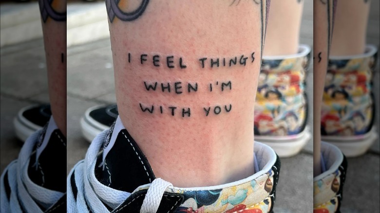
Kerning is not tracking. Tracking is uniform spacing across a word; kerning is optical adjustment between specific pairs. In tattoo design, kerning must be checked at final size on the actual body part, not on a tablet screen.
Practical Kerning Checks
- Zoom to 100%: View the stencil at real-world scale. If the space between ‘r’ and ‘n’ looks tighter than ‘n’ and ‘o’, adjust.
- Flip test: Mirror the design horizontally. Asymmetrical kerning becomes obvious when reversed.
- Blur test: Squint or apply a slight blur. Uneven gaps appear as dark or light patches.
- Pair audit: Check problem pairs: AV, AW, TA, LT, LY, rn, nn, ii, ll. These are where lettering tattoos most often fail.
For fine line lettering, kerning errors under 1mm are visible. For blackwork or ornamental lettering, negative space is part of the design, so kerning must be intentional, not accidental.
Baseline Control: Keeping Letters Grounded
The baseline is the invisible line on which letters rest. In tattoo lettering, baseline drift is the most common structural error. It happens when the stencil is applied to a curved surface or when the artist freehands without a reference line.
Baseline Checklist
- Draw the baseline first: Use a flexible ruler or a laser level for long text. Mark it with a surgical marker before stenciling.
- Check x-height consistency: Lowercase letters should share the same x-height. If ‘e’ and ‘o’ sit at different heights, the baseline is compromised.
- Ascender and descender clearance: Ensure ‘b’, ‘d’, ‘p’, ‘q’ do not collide with adjacent lines or body contours.
- Curve compensation: On a bicep or calf, a straight baseline will look curved when the muscle flexes. Pre-curve the baseline to match resting anatomy.
For geometric or abstract lettering, the baseline may be a grid or a circle. In those cases, verify that all anchor points align to the same geometric system.
Placement Distortion: When Skin Moves
Placement distortion is the difference between the design on paper and the design on a moving body. It is not a flaw in the tattoo; it is a physical reality. The consultation must include a movement test.
Movement and Distortion Tests
- Flex test: Ask the client to flex the muscle under the stencil. Observe how the text stretches or compresses.
- Rotation test: For forearm or wrist lettering, rotate the arm. Text that runs along the radius will distort differently than text across it.
- Gravity test: For rib or thigh lettering, stand and sit. Skin sags and shifts, changing the apparent baseline.
- Adjacent joint check: Keep lettering at least 2cm away from joints if you want to preserve kerning. Near elbows or knees, distortion is unavoidable.
If the client wants a perfect circle of text around a limb, the design must be an ellipse on paper to appear circular on skin. This is standard in ornamental and tribal lettering but often ignored in casual script.
Consultation Checklist: From Brief to Stencil
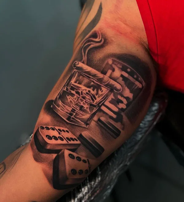
Use this sequence in every lettering consultation. It prevents revisions and protects both artist and client.
- 1. Content confirmation: Spell-check names, dates, and foreign phrases. Confirm punctuation and capitalization.
- 2. Style match: Decide between fine line, blackwork, dotwork, or ornamental lettering. Each has different kerning tolerances.
- 3. Size and scale: Measure the intended height of capital letters. If the client wants 5mm caps, warn that fine line lettering may blur over time.
- 4. Placement mapping: Photograph the body part in resting and flexed positions. Mark the baseline and centerline.
- 5. Stencil proof: Print the stencil at 100% scale. Check kerning and baseline with a ruler before application.
- 6. Movement simulation: Apply the stencil, then have the client move. Adjust if distortion exceeds acceptable limits.
- 7. Aftercare brief: Explain that swelling will temporarily distort lettering. Provide written aftercare instructions. For healing questions, refer to consultation resources.
Booking and Safety Questions for Lettering Tattoos
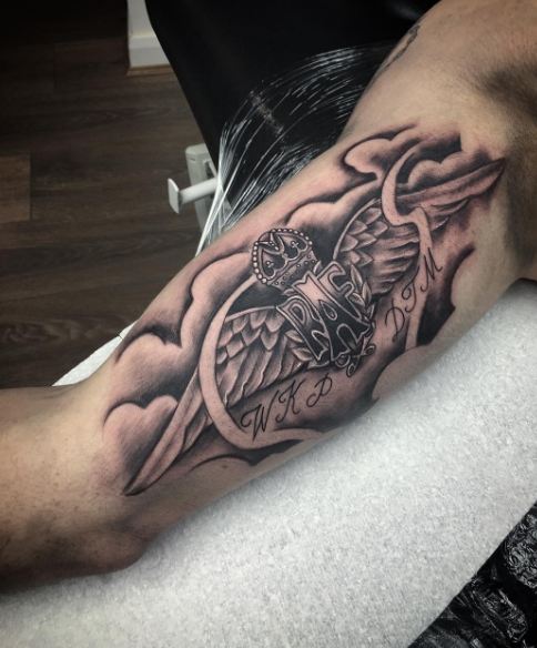
Ask these before paying a deposit. They separate specialists from generalists.
- Can I see healed photos of lettering tattoos at a similar size and placement?
- Do you use a stencil printer or freehand the baseline?
- How do you compensate for curvature on this body part?
- What is your minimum letter height for fine line versus blackwork?
- How do you handle kerning adjustments after the stencil is applied?
- What is your policy on touch-ups for lettering that heals with gaps or blur?
For pricing structures that account for consultation time, see cost estimation guides. For studio vetting, use verified studio directories and check studio profiles for healed lettering portfolios.
Style-Specific Kerning and Baseline Notes
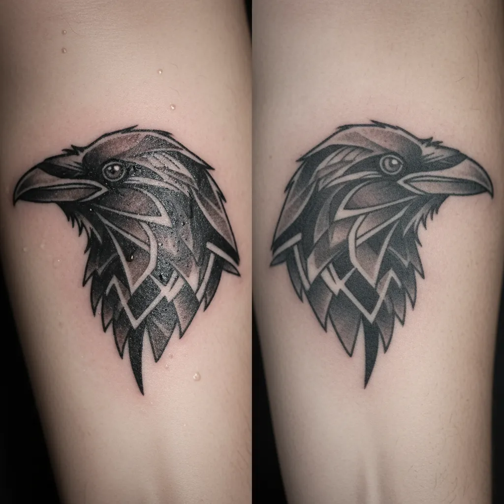
Fine Line Lettering
Fine line uses single needles and low ink volume. Kerning must be wider than you think because lines spread slightly during healing. Baseline control is critical; a 0.5mm drift is visible. Avoid fine line for text under 6mm cap height.
Blackwork and Ornamental Lettering
Blackwork relies on solid fills and high contrast. Kerning is defined by negative space. Baseline can be bold and decorative, but consistency is still required. Ornamental lettering often integrates flourishes that can mask baseline errors, so check the skeleton first.
Dotwork and Geometric Lettering
Dotwork creates texture through stippling. Kerning is less about line weight and more about dot density. Geometric lettering uses grids and circles; baseline is a mathematical construct. Any deviation breaks the system.
Realism and Micro Realism Lettering
Realism lettering mimics calligraphy or engraved text. Kerning must follow the illusion of depth. Micro realism lettering is high-risk: tiny text blurs. Baseline control is nearly impossible under 4mm. Discuss alternatives like abstract or graphic lettering.
Common Myths About Lettering Tattoos
- Myth: Any font works. Script fonts with tight kerning often merge into illegible shapes on skin.
- Myth: You can fix kerning after healing. Touch-ups can add ink but rarely correct spacing without thickening letters.
- Myth: Placement doesn’t matter for short words. Even a three-letter word distorts on a curved or moving surface.
- Myth: More detail is better. In lettering, simplicity preserves kerning and baseline clarity.
FAQ
How do I check kerning before the tattoo is applied?
Print the design at 100% scale, flip it horizontally, and blur it slightly. Uneven gaps become visible. Then apply the stencil and check from two meters away.
Can lettering tattoos be done on a curved body part without distortion?
No. Distortion can be minimized with pre-curved baselines and movement tests, but never eliminated. The goal is controlled distortion, not zero distortion.
What is the minimum size for legible lettering?
For fine line, 6mm cap height is a safe minimum. For blackwork, 5mm. For micro realism, legibility is unpredictable below 4mm. Always prioritize readability over size.
Should I choose a script or block font for my lettering tattoo?
Block fonts are more forgiving for kerning and baseline control. Script fonts require wider spacing and larger sizes. If you want script, ask for a custom-drawn lettering design rather than a converted font.
Final Pre-Booking Checklist
- Content verified and spelled correctly.
- Style chosen: fine line, blackwork, dotwork, ornamental, or geometric.
- Cap height measured and agreed.
- Baseline and centerline marked on skin.
- Kerning checked at 100% scale and flipped.
- Movement and flex tests performed.
- Healed photo examples reviewed.
- Aftercare and touch-up policy understood.
- Deposit and pricing confirmed via cost estimation.
- Studio verified through verified listings.
Lettering tattoos are a typographic discipline. Treat the consultation as a design review, not a small talk session. The result will be text that reads correctly for decades, not just on the day it heals.
Content hub
Tattoo styles pillar
This article belongs to the styles cluster. Open the pillar page to compare Irezumi, Old School, Realistic, Blackwork, Fine line, Geometric and Watercolor.
Related reading
Continue reading
Polynesian Tattoo Healed Portfolio Review: A Specialist Guide to Body Mapping, Symbol Research and Respectful Consultation
A specialist editor's guide to reviewing healed Polynesian tattoo portfolios: body mapping, symbol research, respectful consultation questions, and…
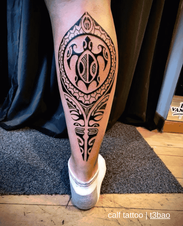
Polynesian Tattoo: Placement and Body-Flow Decisions
A specialist guide to Polynesian tattoo placement and body-flow decisions: body mapping, motif density, symbol research, respectful consultation…

Polynesian Tattoo Design Consultation Checklist: Body Mapping, Symbol Research & Respectful Planning
A specialist Polynesian tattoo consultation checklist covering body mapping, symbol research, cultural permission, technique, booking questions, and respectful…