Lettering Tattoo Placement: A Specialist Guide to Kerning, Baseline Control, and Body-Flow Distortion
Lettering Tattoos: Where Typography Meets Anatomy
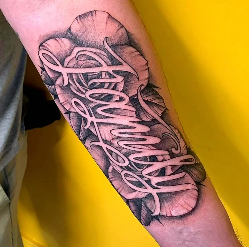
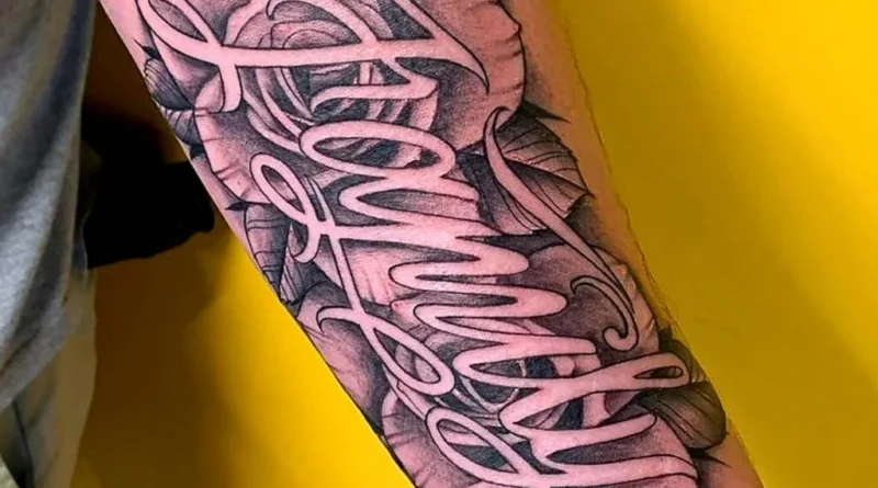
Lettering tattoos live or die by two things: how the letters relate to each other, and how the body moves beneath them. Unlike a Graphic tattoo or an Abstract tattoo, lettering has no room for ambiguity—a warped baseline or a cramped counter reads as a mistake, not a style choice. This guide is for clients and artists who want to get the typography right before the needle touches skin. If you’re still comparing artists, start with our ranking of lettering specialists and verified studio profiles to see portfolios that include healed lettering work.
Kerning and Tracking: The Invisible Grid
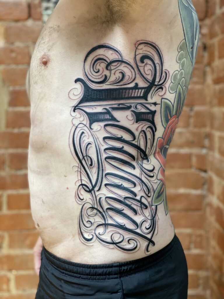
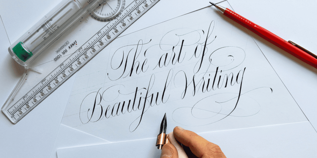
Kerning is the space between individual letters; tracking is the uniform spacing across a word or phrase. In tattooing, both are dictated by the stencil, but the skin will not hold them perfectly. A skilled artist adjusts kerning optically, not mathematically. For example, in a word like “WAVE,” the diagonal of the W and the apex of the A create a visual gap that needs tightening, while the straight stems of V and E can sit closer. If the client wants Fine line lettering, the tracking must be slightly wider than in Blackwork to prevent ink spread from closing the counters.
Practical Kerning Checks
- Print the phrase at actual size and view it from two meters away. If the spacing looks uneven, it will look worse on skin.
- Check letter pairs that commonly fail: AV, WA, LT, ry, and any combination with a diagonal next to a vertical.
- For script lettering, ensure the connecting strokes don’t merge into a blob after healing. Ask to see healed photos, not fresh ones.
- If the phrase includes numbers, verify that 1 and 7 don’t collide, and that 0 doesn’t look like O.
Baseline Control: Straight Lines on Curved Surfaces
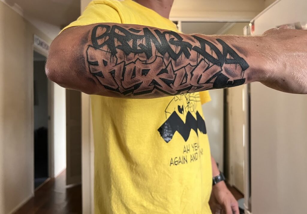
A baseline is the invisible line on which letters sit. On a flat canvas, it’s a ruler. On a calf, forearm, or ribcage, it’s a curve that changes with every muscle contraction. The artist must decide whether to follow the anatomical baseline (the natural flow of the limb) or a geometric baseline (a true straight line). Following the anatomy usually looks more organic; a geometric baseline can appear to bend when the muscle flexes.
For example, a vertical phrase down the spine may look straight when standing but curve when the client bends forward. A horizontal phrase across the collarbone will rise and fall with shoulder movement. Before committing, the artist should stencil the design and have the client move through a range of motion—raise arms, twist torso, flex—to see where the baseline distorts. This is especially critical for Ornamental or Geometric tattoo elements that frame the lettering.
Placement Distortion: How Body Flow Warps Type
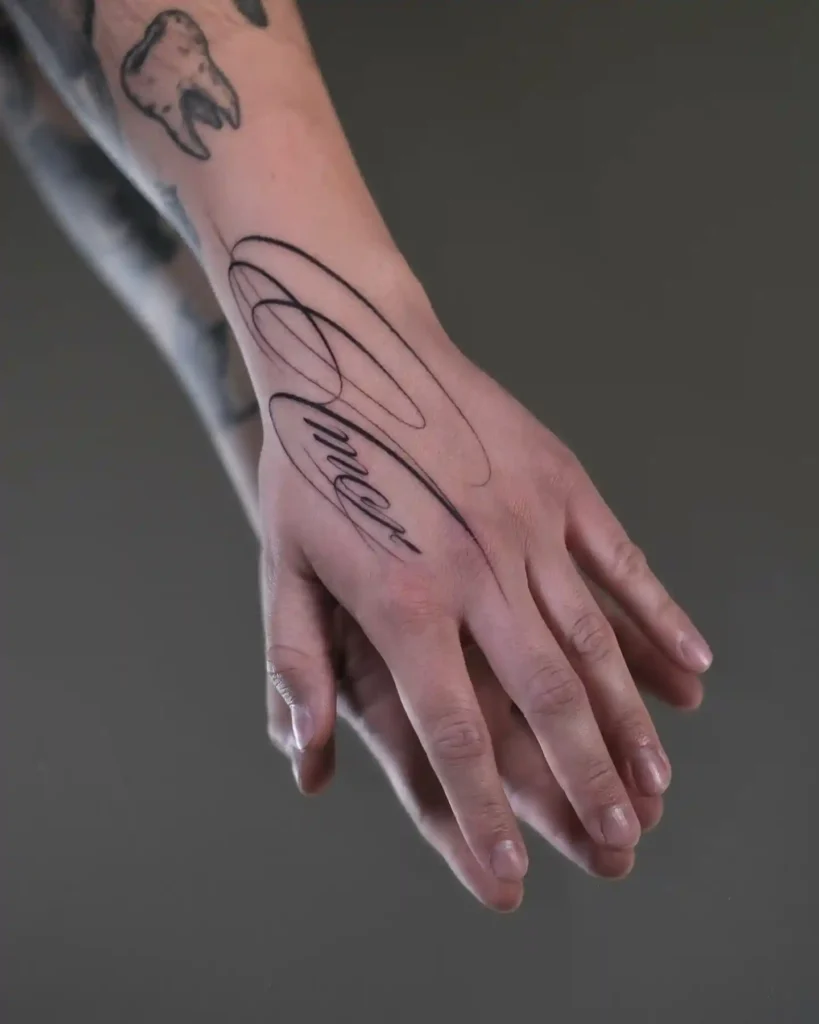
Every body part has a flow—the direction of muscle fibers, skin tension lines, and natural curves. Lettering placed against the flow can stretch, compress, or shear. Here are common placements and their distortion risks:
- Forearm (inner): Relatively flat, but the wrist and elbow create tapering. A long phrase may need to be split or angled.
- Bicep: Curves significantly when flexed. Short words work; long sentences will bow.
- Ribcage: Moves with breathing. Fine line lettering here can blur if the artist goes too shallow or too deep.
- Calf: The gastrocnemius muscle changes shape dramatically when contracted. A vertical phrase may appear to lean.
- Spine: The vertebrae create a natural curve. A straight vertical line will look off-center unless the artist accounts for the spinal furrow.
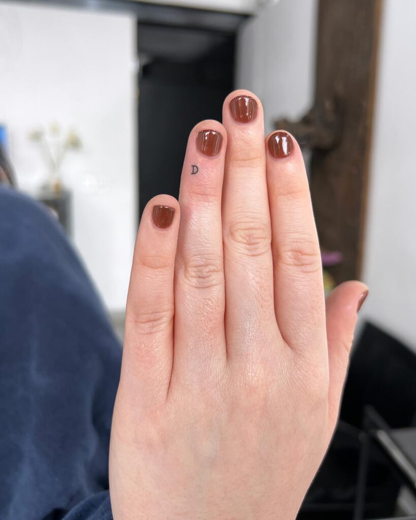
- Fingers: High distortion and rapid fading. Only very short words or initials are advisable.
For clients considering Micro realism or Realism elements alongside lettering, the distortion of the lettering must be planned first, as the realistic element will anchor the composition. Similarly, Watercolor tattoo effects can soften edges, which may compromise the crispness of lettering if not separated by negative space.
Typography Choices That Survive Healing
Not all fonts age well. Script and fine line lettering can lose definition as ink spreads over time. Blackwork and bold sans-serif hold up better. If the client insists on a delicate script, the artist should increase the x-height and stroke width slightly to compensate. Dotwork lettering is possible but requires perfect dot placement; any irregularity reads as a flaw. Japanese traditional and Neo-traditional lettering often use bold, brush-like strokes that tolerate distortion better than thin serifs.
Questions to Ask Before Booking
- Can I see healed photos of lettering in the same placement I’m considering?
- How do you handle baseline distortion when the body moves?
- What is your approach to kerning for the specific phrase I want?
- Do you recommend any adjustments to the font size or weight for long-term legibility?
If you’re unsure about the artist’s typographic skills, check their portfolio for consistent spacing and clean baselines. Our studio directory includes artists who specialize in lettering, and you can request a consultation to discuss your design. For a cost estimate, use our tattoo price estimator.
Checklist: Lettering Placement and Flow
- Print the phrase at actual size and tape it to the intended placement. View in a mirror and from different angles.
- Move through full range of motion—flex, stretch, twist—and note where the baseline shifts.
- Decide on anatomical vs. geometric baseline and confirm with the artist.
- Check kerning pairs and overall tracking; adjust for skin stretch.
- Choose a font weight that will remain legible after healing.
- Confirm the artist has healed examples of similar lettering.
- Discuss aftercare to avoid scarring that could distort the lettering.
Safety and Aftercare for Lettering Tattoos
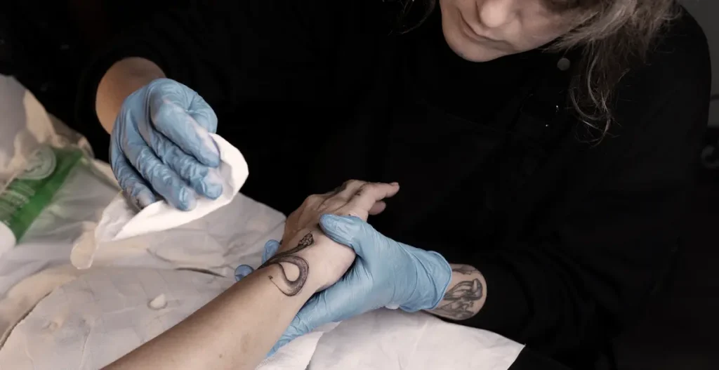
Lettering tattoos are prone to blowouts and scarring because they often involve fine lines and high contrast. Following aftercare instructions is critical. Avoid sun exposure, don’t pick scabs, and keep the area moisturized. If you notice excessive redness, swelling, or ink spreading beyond the intended lines, contact a medical professional. For more aftercare tips, see our magazine articles.
FAQ
1. Can lettering tattoos be done on fingers or ribs?
Yes, but with caveats. Fingers have high distortion and rapid fading; only very short words or initials are advisable. Ribs move with breathing, so fine line lettering may blur. Discuss risks with your artist.
2. How do I ensure my lettering tattoo heals without distortion?
Choose an artist experienced in lettering, follow aftercare strictly, and avoid stretching the skin during healing. Some distortion from ink spread is normal, but proper technique minimizes it.
3. What’s the difference between kerning and tracking in tattoo lettering?
Kerning is the space between specific letter pairs; tracking is the uniform spacing across the whole word. Both affect legibility and must be adjusted for skin.
4. Should I choose a script or block font for a lettering tattoo?
Block fonts hold up better over time. Script can work if the artist increases stroke width and x-height, but it may still blur. Consider your placement and long-term goals.
For more guidance on selecting an artist and planning your tattoo, explore our rankings and verified studios.
Content hub
Tattoo styles pillar
This article belongs to the styles cluster. Open the pillar page to compare Irezumi, Old School, Realistic, Blackwork, Fine line, Geometric and Watercolor.
Related reading
Continue reading

Lettering Tattoo Design Consultation Checklist: Kerning, Baselines, and Placement Distortion
A specialist consultation checklist for lettering tattoos covering kerning, baseline control, and placement distortion. Includes practical tests, booking…
Polynesian Tattoo Healed Portfolio Review: A Specialist Guide to Body Mapping, Symbol Research and Respectful Consultation
A specialist editor's guide to reviewing healed Polynesian tattoo portfolios: body mapping, symbol research, respectful consultation questions, and…
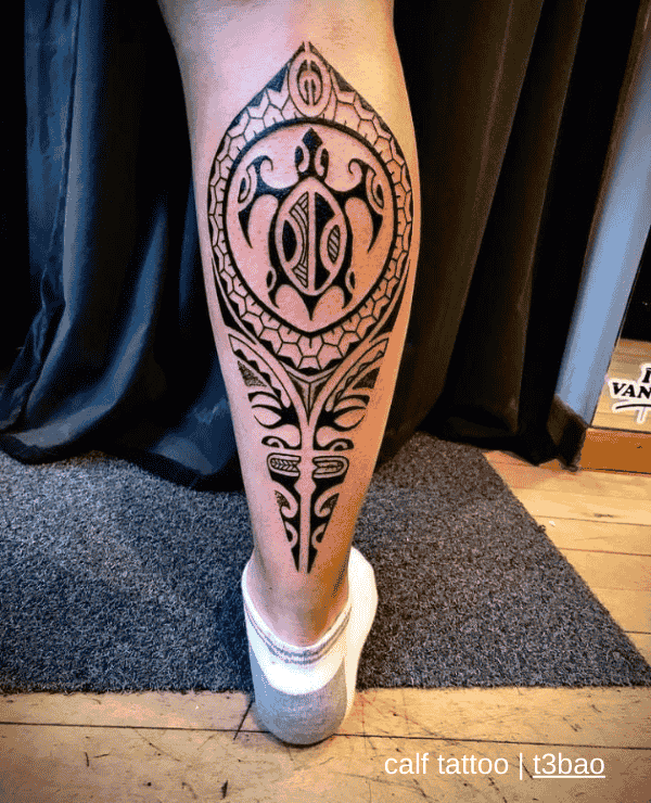
Polynesian Tattoo: Placement and Body-Flow Decisions
A specialist guide to Polynesian tattoo placement and body-flow decisions: body mapping, motif density, symbol research, respectful consultation…