
Lettering Tattoo Healed Portfolio Review: Kerning, Baseline & Placement Distortion
Why Healed Lettering Portfolios Are Judged Differently
Lettering is the least forgiving tattoo discipline. A rose can absorb a wobbly line; a word cannot. Every letterform is a reference shape the eye already knows, so kerning errors, baseline drift and placement distortion read as mistakes rather than style. That is why a healed portfolio review for Lettering has to be stricter than a review for Abstract tattoo or Watercolor tattoo, where ambiguity is part of the brief.
This guide is a specialist checklist. It assumes you already want Lettering, script, blackletter or a short phrase, and you are comparing artists through healed work rather than fresh photos. Use it alongside our artist ranking criteria and the portfolios on verified studio profiles.
Read Healed, Not Fresh: The Three-Month Rule
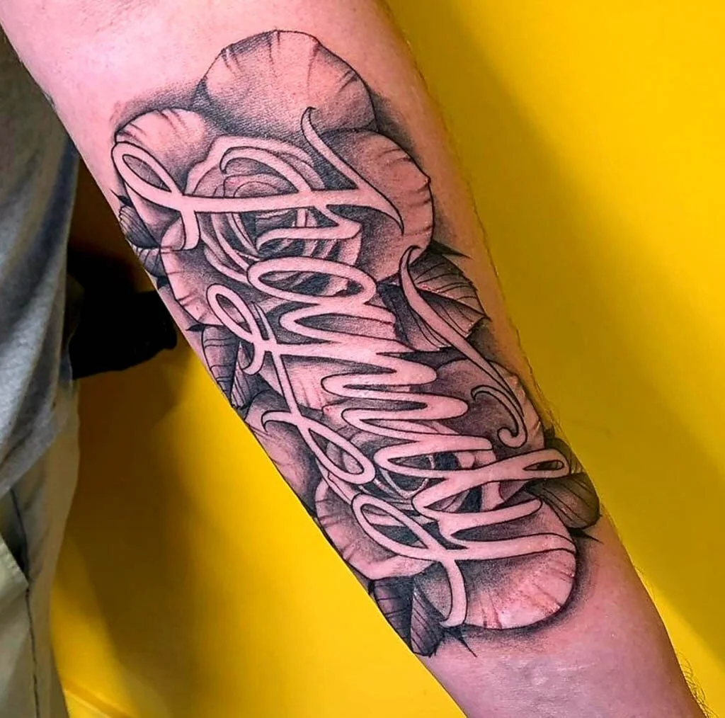
Fresh lettering is a lie told by swelling. Edges look sharper, spacing looks tighter, and thin strokes look more confident than they will be at eight weeks. Ask for healed images at three months minimum, ideally six to twelve. On arms and legs, six months is enough to judge line spread. On ribs, sternum, hands, feet and neck, wait longer.
What to look for in a healed photo
- Stroke weight consistency across the whole phrase, not just the first word.
- Terminal shapes: do the serifs or script tails still end deliberately, or have they blurred into a taper?
- Ink migration: fine line Lettering under 0.25 mm often softens; check whether the artist compensates with slightly heavier linework.
- Skin texture: healed photos should show pores and hair, not a filtered blur. A portfolio that only posts smoothed images is hiding resolution.
Kerning: The Check Most Clients Miss
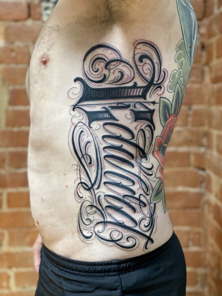
Kerning is the space between individual letters. In tattoo Lettering it is decided twice: once in the stencil, once by how the skin stretches during the session. Bad kerning is the most common complaint in lettering touch-up requests.
Practical kerning checks
- Look for optical spacing, not measured spacing. Round letters like O and C need to sit slightly closer than straight letters like H and N.
- Check pairs that fail most often: AV, AW, LT, TA, ry, va, and any lowercase pair with a diagonal.
- In script, check the joins. A rushed connector reads as a smudge after healing.
- In blackletter, check the counter spaces. If the negative shapes close up, the word becomes a block.
Ask the artist whether they kern manually or rely on a font default. A specialist will redraw spacing for the phrase, not paste a typeface. If they cannot explain the adjustment, that is a signal to keep looking. Our consultation notes cover how to raise this without sounding confrontational.
Baseline Control and Optical Alignment
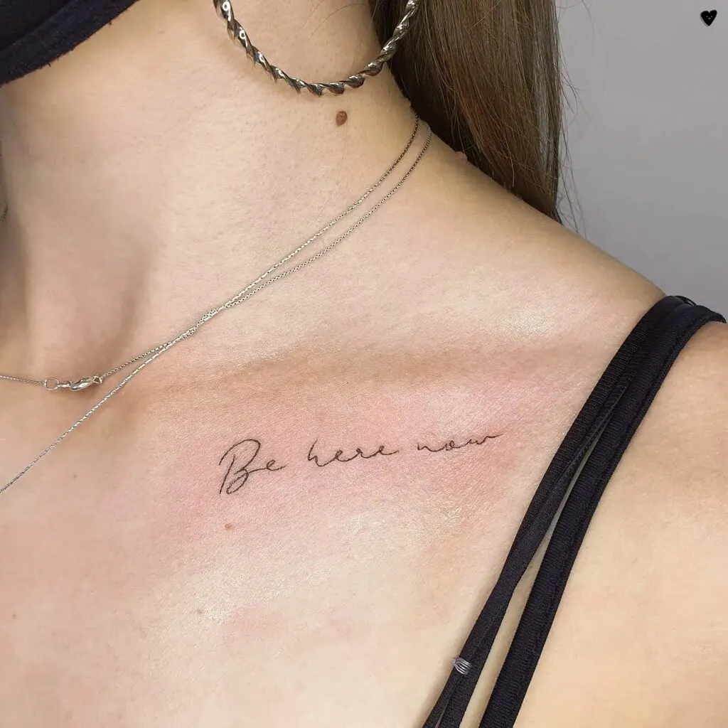
The baseline is the invisible line the letters sit on. In a straight-line tattoo it should read level on the body, which is not the same as level on paper. Bodies curve, and a stencil placed flat on a curved surface will distort when the skin returns to rest.
Checks for baseline and x-height
- X-height consistency: lowercase letters should share a visual height. Watch for a single tall ‘e’ or short ‘o’.
- Ascender and descender clearance: g, y, p, j and b, d, h, k, l should not collide with the line above or below.
- Optical centring: a phrase centred by measurement often looks off-centre. Check whether the artist nudged it visually.
- Curved baselines: on a bicep, forearm or calf, a straight baseline can look tilted. A slight arc is often correct.
Placement Distortion: Where Lettering Fails
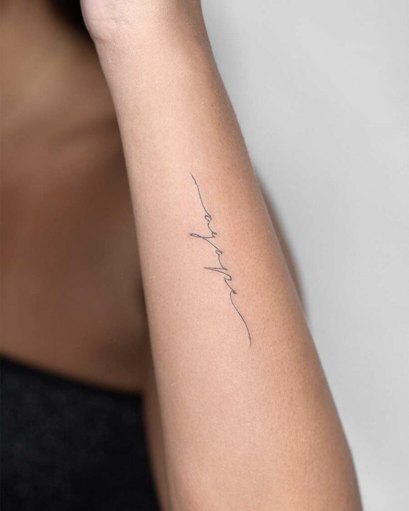
Placement distortion is the gap between the stencil and the healed result caused by anatomy, movement and skin behaviour. It is not a style problem; it is a planning problem.
High-risk placements
- Inner bicep and inner forearm: rotation and compression change spacing when the arm bends.
- Ribs and sternum: breathing moves the canvas continuously. Long phrases drift.
- Hands, fingers and feet: high friction, fast fading, and fine line Lettering rarely holds crisp edges.
- Neck and throat: skin is thin and mobile; tight kerning collapses.
- Over joints: the phrase will crease. Short words survive; long sentences do not.
If the design is a full sentence, ask how the artist plans for movement. A specialist may break the line, increase letter height, or refuse the placement. Refusal is a good sign. Compare this with studio workflow standards before you book.
Style Interactions: When Lettering Meets Other Disciplines
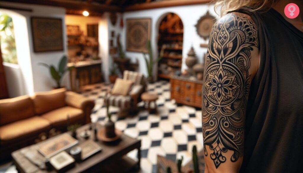
Lettering rarely exists alone. It is often combined with Ornamental, Geometric tattoo, Blackwork or Dotwork framing. Each combination changes how the letters age.
- Lettering + Ornamental: fine ornamental lines can compete with thin letter strokes. Check healed contrast between the two.
- Lettering + Blackwork: heavy fills can make thin letters look weak. Weight balance matters.
- Lettering + Dotwork: dot shading behind text can reduce legibility at distance.
- Lettering + Micro realism: a realistic portrait next to script needs a weight match, or the text disappears.
- Lettering + Japanese traditional or Neo-traditional: background elements can crowd the baseline. Check negative space.
For a broader style comparison, the magazine archive has breakdowns of Realism, Graphic tattoo and Tribal, but keep the review criteria specific to Lettering.
Booking Questions That Reveal a Specialist
- Can you show healed Lettering at six months or older, not just fresh?
- Do you redraw kerning for each phrase, or use the font as-is?
- How do you compensate for skin stretch on this placement?
- What minimum stroke weight do you recommend for this area?
- How do you handle a touch-up if the baseline drifts after healing?
- Do you charge for the drawing and stencil session separately?
Pricing questions belong in a separate conversation. Our cost estimation guide explains why lettering is often priced by complexity rather than size alone.
Safety and Skin Caveats
No article can replace an in-person assessment. Healed results depend on skin type, aftercare, sun exposure and immune response. If a portfolio shows inconsistent healing across similar placements, ask why. Do not treat any healed photo as a guarantee for your own skin. Avoid sun exposure on fresh lettering, and follow the artist’s aftercare instructions rather than internet folklore.
FAQ
How old should healed Lettering photos be before I trust them?
Three months is the minimum for line spread and kerning judgement. Six to twelve months is better, especially for fine line work and high-movement placements.
Can kerning be fixed after healing?
Sometimes. Small spacing errors can be adjusted with a touch-up, but large errors may require reworking or covering. Prevention at stencil stage is far cheaper.
Is fine line Lettering a bad choice?
Not inherently, but it ages faster on hands, feet and joints. Ask for healed examples at the same stroke weight and placement before committing.
Should I choose an artist who only does Lettering?
Not necessarily. A specialist in Blackwork or Ornamental can execute strong Lettering if their healed portfolio shows consistent kerning and baseline control. Judge the healed work, not the label.
Content hub
Tattoo styles pillar
This article belongs to the styles cluster. Open the pillar page to compare Irezumi, Old School, Realistic, Blackwork, Fine line, Geometric and Watercolor.
Related reading
Continue reading
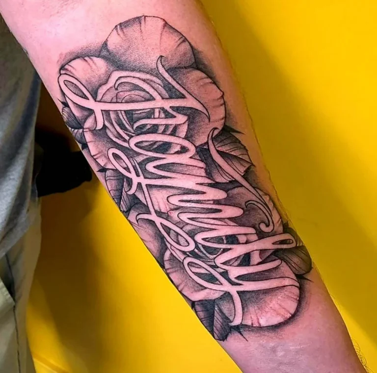
Lettering Tattoo Placement: A Specialist Guide to Kerning, Baseline Control, and Body-Flow Distortion
A specialist guide to lettering tattoos focusing on kerning, baseline control, and placement distortion. Learn how to plan…

Lettering Tattoo Design Consultation Checklist: Kerning, Baselines, and Placement Distortion
A specialist consultation checklist for lettering tattoos covering kerning, baseline control, and placement distortion. Includes practical tests, booking…
Polynesian Tattoo Healed Portfolio Review: A Specialist Guide to Body Mapping, Symbol Research and Respectful Consultation
A specialist editor's guide to reviewing healed Polynesian tattoo portfolios: body mapping, symbol research, respectful consultation questions, and…