Neo-Traditional Tattoo Placement and Body-Flow: A Specialist’s Guide to Line Hierarchy, Decorative Framing, and Controlled Color
Introduction: Beyond the Style Label
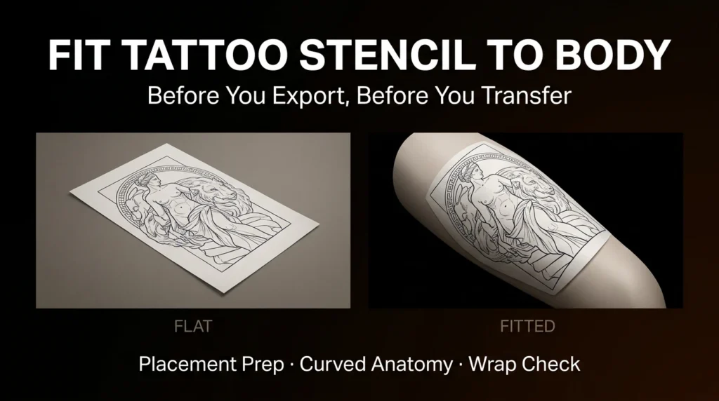
Neo-traditional is often reduced to “bold lines and muted colors,” but that misses the real craft. This style is a dialogue between classic American tattooing and modern illustrative complexity. The difference between a good neo-traditional piece and a great one lies in three things: how your line hierarchy directs the eye, how decorative framing responds to your anatomy, and how controlled color saturation holds the composition together. This guide is for collectors who want more than a pretty picture—it’s about making placement and body-flow decisions that will age well and look intentional.
Line Hierarchy: The Backbone of Placement
Line weight is your first tool for creating depth and movement. In neo-traditional, you’ll typically use three levels of line weight: heavy outer contours (8-11 round liners), medium internal lines (5-7), and fine detail lines (3 or less). Before you commit to a placement, think about how these lines will follow your body’s natural contours.
Curved Areas: Ribs, Shoulders, and Calves
On curved surfaces, heavier lines can act as anchors, but they must flow with the muscle or bone structure. For example, a neo-traditional rose on the shoulder should have its outer petals following the deltoid curve. If the heavy outline cuts across the muscle, it will look static and fight the body’s movement. Instead, let the line hierarchy mimic the underlying anatomy: thick lines on the lower edge of the curve, thinner lines on the upper edge to suggest light.
Flat Areas: Forearm, Thigh, and Back
Flatter areas give you more freedom, but they also demand a stronger internal hierarchy. Without body curvature to guide the eye, your line weights must create the illusion of depth. A common mistake is using the same weight for every outline—this flattens the design. Instead, use heavy lines for the main subject, medium for secondary elements, and fine lines for textures like fur, feathers, or leaves. This creates a clear focal point.
Decorative Framing: Working With Your Anatomy

Neo-traditional often includes ornamental frames—mandalas, filigree, geometric borders, or even Japanese-inspired waves. These frames are not just decorations; they are tools to integrate the tattoo with your body’s shape.
Frames That Follow the Body
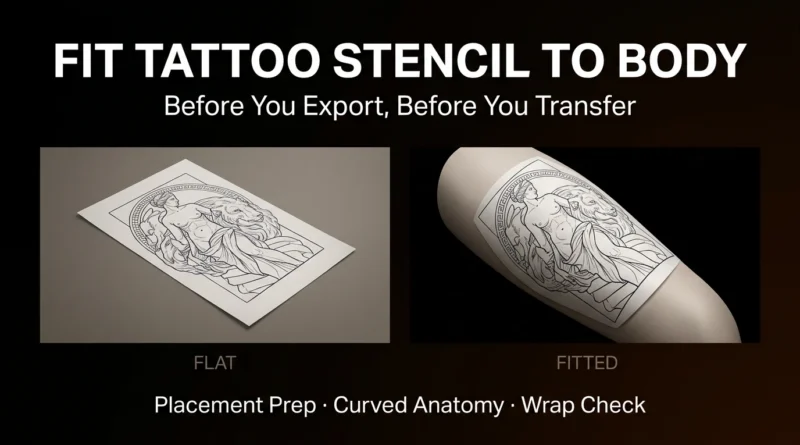
A frame should echo the natural lines of the area. For a shoulder cap, a circular or oval frame works well because it mirrors the deltoid. For a forearm, a vertical frame that tapers toward the wrist can elongate the limb. For a thigh, a frame that widens at the top and narrows at the knee can flatter the quadriceps. Avoid rigid squares or rectangles on curved areas—they will look like stickers.
Negative Space and Flow
Decorative framing is also about negative space. A dense frame can make the central subject pop, but if the frame is too heavy, it can overwhelm the piece. Use thin, ornamental lines (with fine line or dotwork) to create a lattice that lets the skin breathe. This is especially important on areas that move a lot, like the elbow or knee, where a solid frame will distort with movement.
Controlled Color: Saturation and Placement
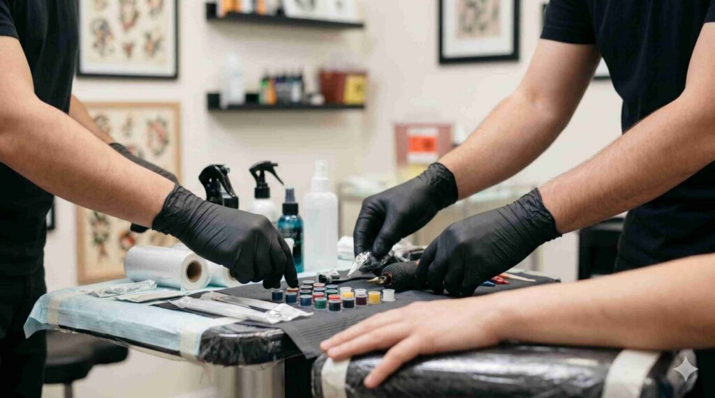
Color in neo-traditional is not about chaos—it’s about control. The palette is often muted, with earthy tones, but you can also use vibrant accents. The key is to plan saturation based on the placement.
High-Movement Areas: Less Saturation, More Contrast
On areas that stretch and twist, like the inner elbow or the side of the knee, heavy saturation can blur or fade faster. Instead, use less color and rely on line weight and negative space to carry the design. For example, a neo-traditional snake on the forearm can have a muted green with heavy black shading, which will hold up better than a fully saturated red.
Low-Movement Areas: Full Saturation
On stable areas like the chest, back, or upper thigh, you can push saturation. A fully saturated red rose with deep green leaves will stay crisp because the skin doesn’t move as much. But remember: color placement should also follow the body’s contours. Use darker colors in the recesses (like the armpit side of a chest piece) and lighter colors on the high points (like the pectoral muscle).
Practical Placement Checks
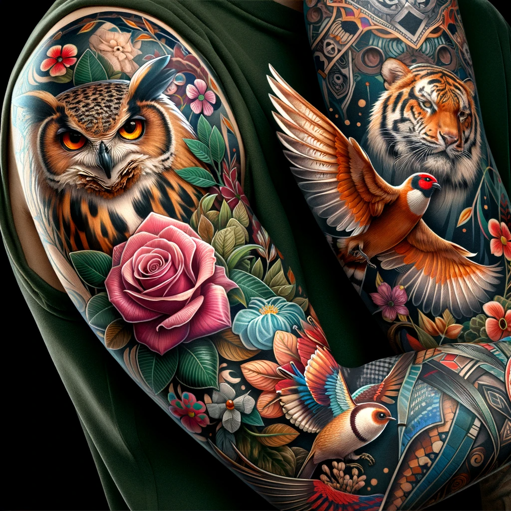
Before you book, run through this checklist with your artist:
- Line flow: Does the main outline follow a muscle or bone? If not, can the design be rotated or adjusted?
- Frame orientation: Is the frame symmetrical with the body’s natural axis? For example, on a forearm, the frame should align with the ulna/radius.
- Color plan: Which areas will get full saturation, and which will be lighter? This should match the movement of the area.
- Future expansion: If you plan to add more tattoos later, will this piece leave room for others? Avoid framing that cuts off potential adjacent placements.
- Age simulation: Ask your artist to show you how the design will look in 10 years. Heavier lines and less saturated areas often age better.
Booking and Safety Questions
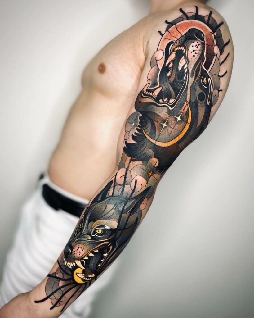
When you consult with an artist, ask these specific questions:
- “How will you adjust the line hierarchy for this curved area?”
- “What is your approach to color saturation on a high-movement spot?”
- “Can you show me examples of your neo-traditional work that have aged well?”
- “Do you have a portfolio of decorative frames on similar body parts?”
Also, check the studio’s hygiene practices. Look for autoclave sterilization, single-use needles, and gloves. You can find verified studios on our verified studios page.
FAQ
1. Can I get a neo-traditional tattoo on my ribs if I have a low pain tolerance?
Ribs are a high-pain area, but the style itself doesn’t change that. However, because neo-traditional often uses heavy lines, the pain can be more intense. Consider a smaller design with lighter line weights if you’re worried. Talk to your artist about numbing options—some studios offer topical anesthetics, but always check safety guidelines.
2. How do I choose between a circular frame and a freeform design?
Circular frames work best on areas that are naturally round, like the shoulder cap or the back of the hand. Freeform designs are better for areas that twist, like the forearm or thigh. Look at your body’s natural shapes and let them guide you. Your artist can help you decide during the consultation.
3. Will muted colors fade faster than blackwork?
All tattoos fade over time, but muted colors can lose their vibrancy more quickly, especially if they’re not saturated properly. That’s why controlled color is key. Use darker shades in areas that see more sun exposure, and always wear sunscreen. Blackwork and heavy black shading tend to hold up better, so you might want to incorporate more black contrast.
4. Can I combine neo-traditional with other styles like fine line or geometric?
Absolutely. Neo-traditional blends well with fine line for delicate details, geometric for framing, and even dotwork for shading. The key is to keep the line hierarchy consistent. If you mix too many styles, the piece can look chaotic. Stick to one dominant style and use others as accents.
Conclusion
Neo-traditional is a style that rewards thoughtful planning. By focusing on line hierarchy, decorative framing, and controlled color, you can create a tattoo that not only looks stunning on day one but also ages gracefully. Remember, placement is not just about where it looks good in the mirror—it’s about how it moves with your body. Take your time, consult with a specialist, and trust the process. For more inspiration, check our style journal or get a price estimate for your next piece.
Read more
- Magazine for more tattoo knowledge, style guides and aftercare notes.
- Request a consultation if you need help with style, placement or preparation.
- Marketplace for equipment, supplies and learning resources.
Content hub
Tattoo styles pillar
This article belongs to the styles cluster. Open the pillar page to compare Irezumi, Old School, Realistic, Blackwork, Fine line, Geometric and Watercolor.
Related reading
Continue reading
Lettering Tattoo Healed Portfolio Review: Kerning, Baseline & Placement Distortion
A specialist healed-portfolio review guide for Lettering tattoos, focused on kerning, baseline control and placement distortion. Includes concrete…
Lettering Tattoo Placement: A Specialist Guide to Kerning, Baseline Control, and Body-Flow Distortion
A specialist guide to lettering tattoos focusing on kerning, baseline control, and placement distortion. Learn how to plan…

Lettering Tattoo Design Consultation Checklist: Kerning, Baselines, and Placement Distortion
A specialist consultation checklist for lettering tattoos covering kerning, baseline control, and placement distortion. Includes practical tests, booking…