Illustrative Tattoo Placement: Shape Language, Focal Points, and Readable Composition
Illustrative Tattoo Placement: Where the Drawing Meets the Body
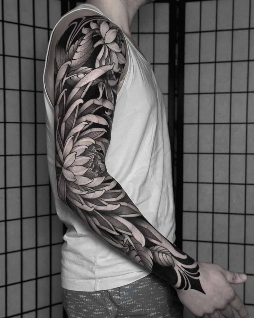
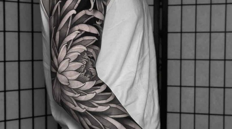
Illustrative tattoo lives or dies by composition. Unlike a flash sheet where the drawing sits on white paper, an illustrative piece has to survive curvature, joint movement, muscle flexion, and the way a limb reads from a normal viewing distance. Placement is not an afterthought bolted onto a finished sketch; it is part of the drawing. This guide is about the decisions a specialist makes before the stencil touches skin: shape language, focal hierarchy, negative space, and body-flow. If you are still comparing artists rather than placements, start with our artist ranking criteria and then come back to this page with a specific body area in mind.
Illustrative is a broad umbrella. It can be rendered with Fine line, Blackwork, Dotwork, Realism, or Micro realism, and it can borrow structure from Geometric, Abstract, Graphic, or Ornamental work. What unifies the category is that the image reads as a drawn illustration rather than a symbolic emblem or a purely abstract mark. That distinction matters because illustrative work depends on internal detail, and internal detail is exactly what placement can compress or destroy.
Shape Language: Match the Silhouette to the Surface
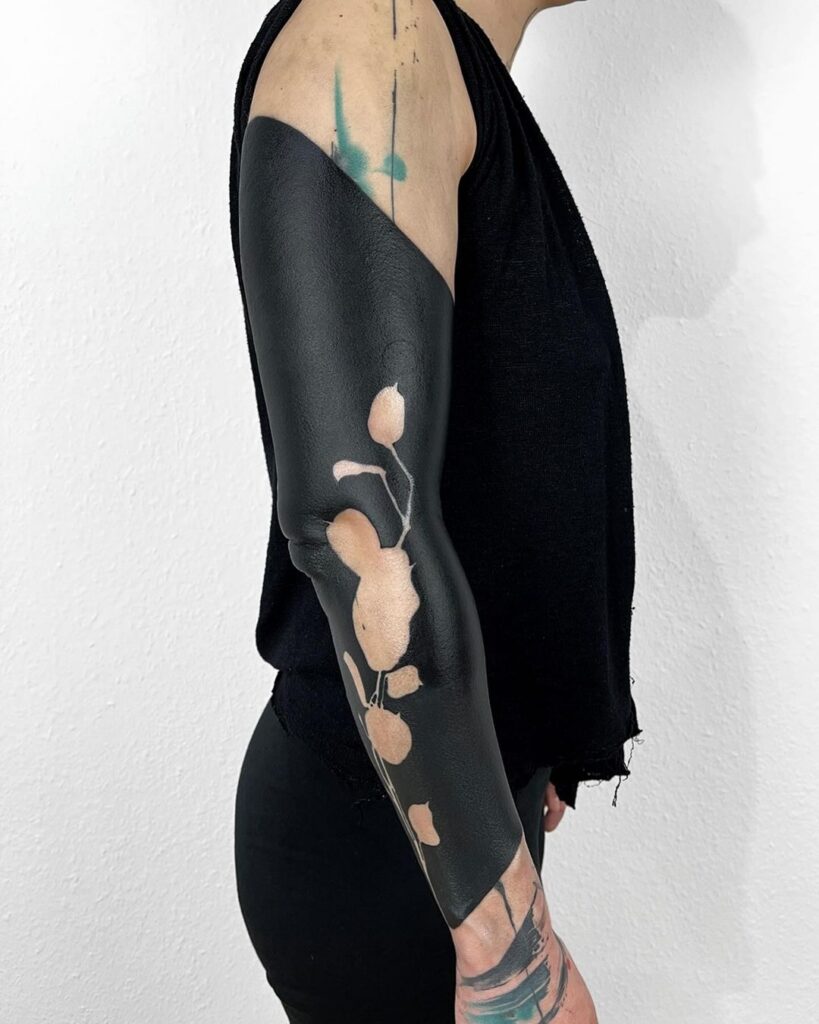
Every body area has a natural silhouette. A good illustrative placement does not fight it. The outer contour of the tattoo should echo the outer contour of the limb or torso panel it occupies.
Vertical, horizontal, and diagonal reads
- Vertical shapes — tall floral stems, elongated figures, stacked narrative panels — sit naturally on the forearm, outer calf, spine, and sternum. They follow the long axis of the body and stay readable when the limb is at rest.
- Horizontal shapes — wide landscapes, reclining figures, side-profile animals — suit the upper back, chest, thigh, and forearm wrap. They need width more than height.
- Diagonal shapes — dynamic action poses, falling objects, wind-blown hair — work on the shoulder cap, hip, and calf where the body already carries a diagonal line.
Enclosed versus open shapes
Illustrative work often uses an open silhouette with soft edges. On a flat surface that reads beautifully. On a curved surface such as the inner bicep or the side of the ribcage, an open silhouette can lose its boundary and start to look unfinished. A practical fix is to add a subtle structural element — a light Ornamental border, a geometric frame, or a deliberate Blackwork anchor — so the eye still finds an edge. The reverse problem appears on the knee, elbow, and ankle, where an enclosed shape can distort badly when the joint bends.
Focal Points: Give the Eye One Job
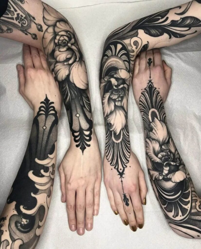
An illustrative tattoo needs a primary focal point and usually one secondary point. More than that and the piece becomes a texture rather than an image.
Where focal points naturally land
- On the forearm, the strongest focal area is the upper third, near the elbow crease, because that is where the arm is widest and most visible in conversation.
- On the upper back, the focal point should sit between the shoulder blades, slightly above the midpoint, so it reads when the wearer is seated or standing.
- On the thigh, the focal point works best on the outer sweep, not the inner line, because the inner thigh is rarely seen at full light.
- On the calf, place the focal point on the upper belly of the muscle, not the lower taper, or the detail will compress into the ankle.
Contrast hierarchy
Focal points are built with contrast, not size alone. A Dotwork eye, a Blackwork silhouette against skin, or a sharp Realism highlight will pull attention faster than a large area of mid-tone shading. If the entire illustrative piece is rendered at the same value, the eye has nowhere to rest and the tattoo reads as noise. Ask your artist to show you the value plan — a simple map of where the darkest darks and lightest lights will sit — before the stencil is approved.
Readable Composition: Distance, Scale, and Negative Space
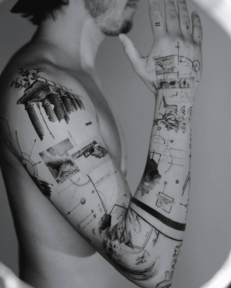
Readability is tested at three distances: arm’s length, across a table, and across a room. An illustrative piece that only works at arm’s length is a sketchbook drawing transferred to skin, not a tattoo.
Scale rules that hold up
- Fine line and Micro realism need generous scale to survive. A detailed face rendered at four centimeters will blur within a few years; the same face at twelve centimeters has room for structure.
- Blackwork and Graphic work tolerate smaller scale because the shapes are bolder and the edges are fewer.
- Watercolor tattoo effects and soft gradient washes need even more room than line work, because soft edges lose definition first.
- Lettering and Ornamental elements can sit at smaller scale, but they should not be used to rescue an illustrative composition that is already too dense.
Negative space is a structural tool
In illustrative tattoo, negative space is not empty space. It is the pause that lets the eye separate one shape from another. On a busy area such as the inner forearm, a crowded composition with no skin breaks will read as a dark smear from two meters away. On a broad area such as the back or thigh, too much negative space can make the piece look unfinished. The correct ratio depends on the subject: a Japanese traditional or Neo-traditional illustrative piece usually wants a clear background structure, while a delicate Fine line botanical may want the skin to carry most of the composition.
Body-Flow: Designing for Movement, Not Just Stillness
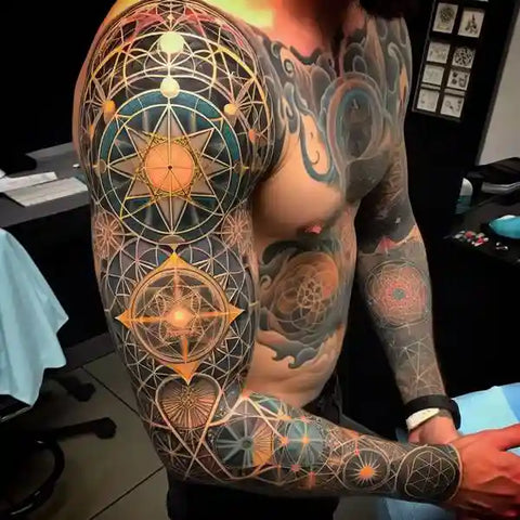
Body-flow is the way a tattoo moves with the body. It is the difference between a design that looks correct on a flat stencil and one that looks correct when the wearer reaches, twists, or bends.
Joint-adjacent placement
Joints are the hardest areas for illustrative work. The elbow, knee, wrist, and ankle compress and stretch skin dramatically. A face placed directly on the elbow will distort every time the arm bends. The usual solution is to place the focal point away from the joint crease and let secondary elements — foliage, abstract marks, geometric connectors — pass across the joint instead. This keeps the important detail stable and gives the piece a sense of continuity.
Muscle direction and flow lines
Muscles have a direction. The deltoid wraps, the forearm tapers, the calf swells and narrows. Illustrative compositions should follow those directional lines rather than cut across them at random. A figure in motion, for example, reads better when the implied movement follows the muscle rather than opposing it. This is one reason a good artist will ask you to stand, move, and relax during placement planning rather than only looking at a static stencil.
Practical Checklist Before You Approve Placement
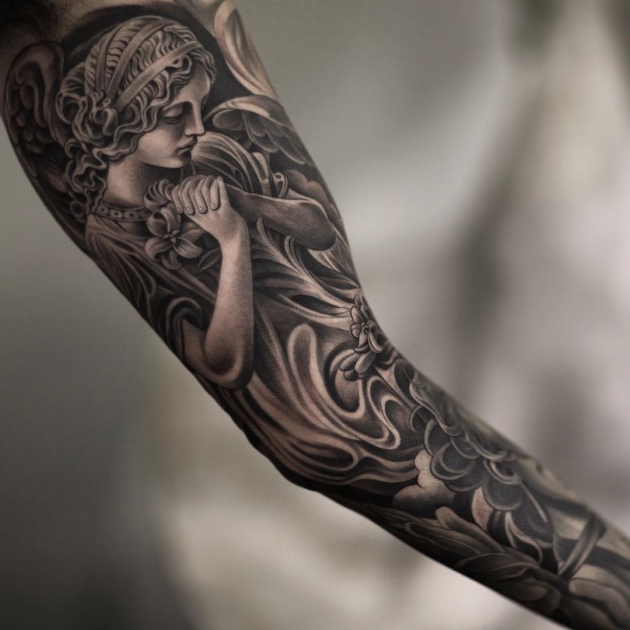
- View the stencil in a mirror, not just on the body part you can see directly. The mirrored view exposes asymmetry and awkward focal points.
- Check the piece at arm’s length, at two meters, and in a photograph. If it fails at any distance, adjust scale or contrast.
- Confirm the focal point sits on a stable area, not a joint crease or a high-friction zone.
- Ask where the darkest values will sit and whether they will compete with the focal point.
- Confirm the silhouette has a readable edge on curved surfaces.
- Ask how the composition will change when the limb is bent, raised, or relaxed.
- Review the value plan and the negative-space plan together, not separately.
Booking and Safety Questions Worth Asking
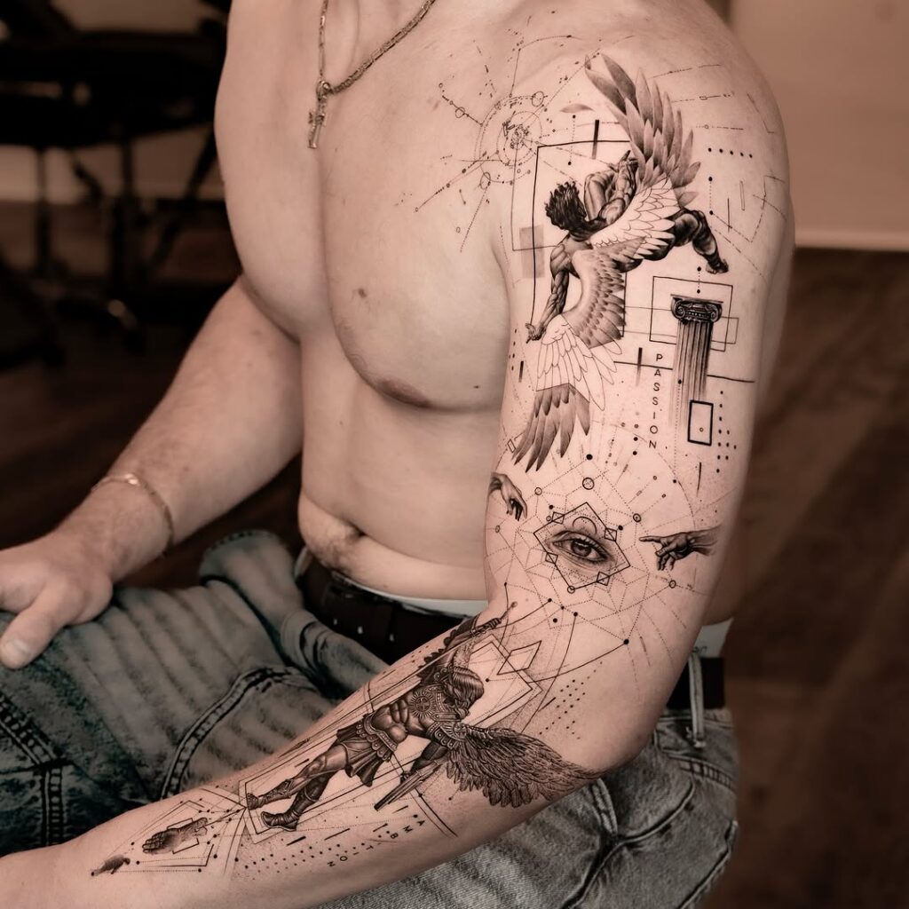
Placement decisions are also practical decisions. Before you book, ask how the artist handles stencil adjustments, whether they will redraw for a different body area if the first placement fails, and how they plan for healing across a joint. If you are comparing studios, our studio directory and verified studio listings can help you filter by portfolio relevance rather than by proximity alone. For pricing context on larger illustrative pieces, see our tattoo price estimate guide, and for aftercare and healing timelines, check the magazine archive. If you want a second opinion on a composition before committing, a consultation is cheaper than a cover-up.
One caveat: no placement guarantees a perfect result. Skin thickness, sun exposure, friction, and healing behavior all affect how an illustrative piece ages. A specialist will tell you which areas will hold detail and which will soften, and will adjust the composition accordingly rather than promising permanence of fine detail.
FAQ
Is illustrative tattoo better on the forearm or the upper arm?
Both work, but they solve different problems. The forearm offers a vertical canvas and strong visibility, which suits tall illustrative compositions and clear focal points. The upper arm offers more width and a rounder surface, which suits wider scenes and wrapped designs. The deciding factor is the shape of your specific drawing, not a general rule.
How small can Fine line or Micro realism illustrative work go?
Smaller than most people expect, but not as small as many request. Fine line and Micro realism rely on internal detail, and detail needs physical space to remain legible over time. A specialist will usually recommend increasing scale rather than reducing line weight to fit a small area.
Should an illustrative tattoo cross a joint?
Secondary elements can cross a joint, but primary focal points should not sit directly on a joint crease. The crease compresses and stretches, which distorts faces, hands, and fine detail. Let foliage, abstract marks, or geometric connectors carry the transition instead.
How do I know if my composition has a clear focal point?
Look at the piece from two meters away. If your eye lands on one area first and then travels to a secondary area, the hierarchy is working. If your eye bounces around with no clear entry point, the composition needs more contrast separation or less internal detail.
Content hub
Tattoo styles pillar
This article belongs to the styles cluster. Open the pillar page to compare Irezumi, Old School, Realistic, Blackwork, Fine line, Geometric and Watercolor.
Related reading
Continue reading
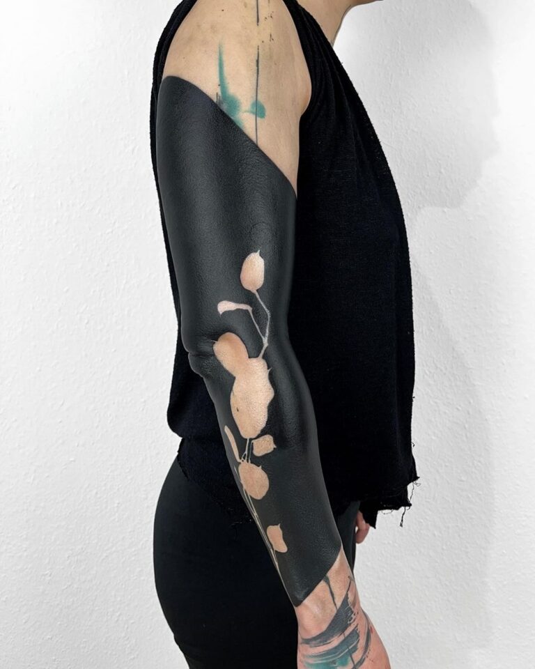
Illustrative Tattoo Design Consultation Checklist: Shape Language, Focal Points and Readable Composition
A specialist consultation checklist for illustrative tattoos: test silhouette readability, define shape language, build focal hierarchy, budget line…
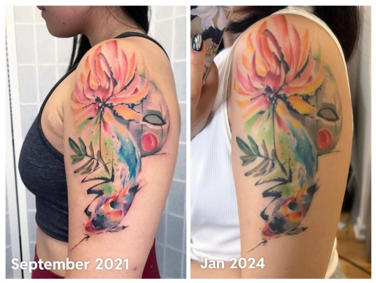
Watercolor Tattoo Healed Portfolio Review: Edge Strategy, Pigment Contrast, and Long-Term Maintenance
A specialist guide to reviewing healed watercolor tattoo portfolios. Learn to assess edge strategy, pigment contrast, and long-term…
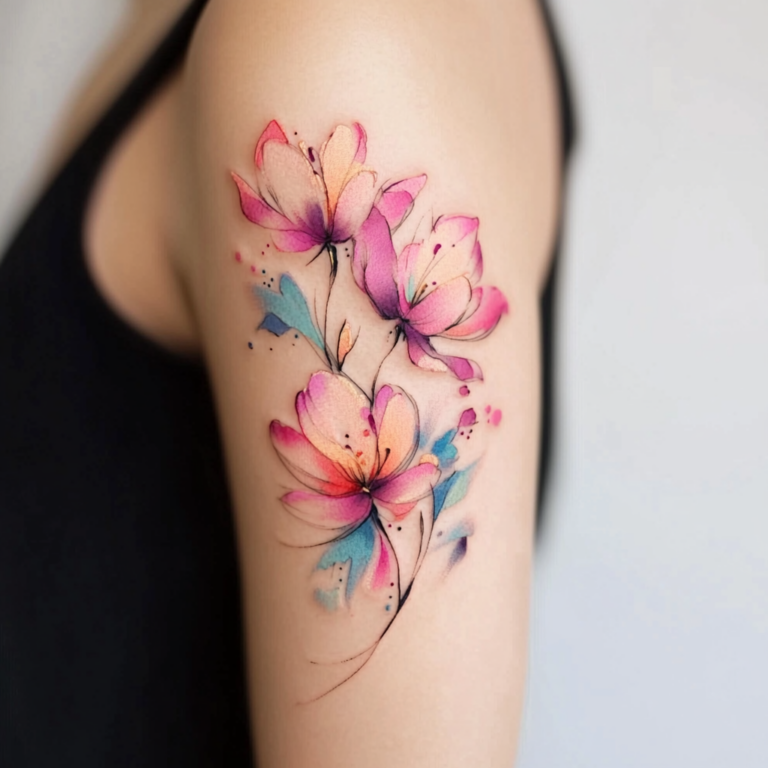
Watercolor Tattoo: Placement, Body-Flow, Edge Strategy, Pigment Contrast, and Long-Term Maintenance
A specialist guide to watercolor tattoo placement and body-flow. Learn edge strategy, pigment contrast checks, long-term maintenance, and…