
Illustrative Tattoo Healed Portfolio Review Guide: Shape Language, Focal Points, Readable Composition
Why Healed Photos Decide an Illustrative Tattoo
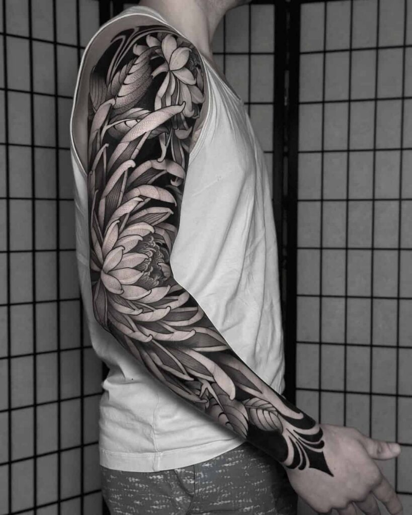
An illustrative tattoo is judged twice: fresh, when contrast is flattering and lines are crisp, and healed, when the skin has settled and the real structure shows. Most portfolios fail at the second test. A specialist review of a healed illustrative portfolio is not about taste — it is about shape language, focal hierarchy and whether the composition still reads at arm’s length.
Use this guide to audit any artist’s healed illustrative work before you book. For broader context on how portfolios are ranked and verified, see our ranking criteria and verified studio profiles.
Read Shape Language Before Detail
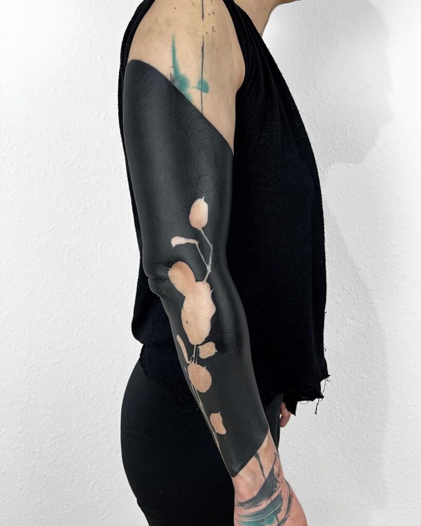
Illustrative work lives or dies on silhouette. Squint at the healed photo until detail disappears. What remains should be a clear, intentional shape.
Primary, secondary and tertiary shapes
- Primary: the one mass the eye locks onto first — a wing, a face plane, a botanical cluster.
- Secondary: shapes that support the primary without competing.
- Tertiary: texture, Dotwork shading, fine line accents.
If tertiary detail carries the image, the tattoo will flatten as it ages. Fine line and Micro realism are especially vulnerable: hairline strokes can blur into a soft grey haze within a few years, so the underlying shape must hold.
Shape consistency
Check whether the artist repeats a coherent vocabulary: tapered points, rounded masses, angular planes. Mixing soft Watercolor washes with hard Geometric tattoo edges can work, but only when the artist controls the transition deliberately.
Focal Points and Visual Hierarchy
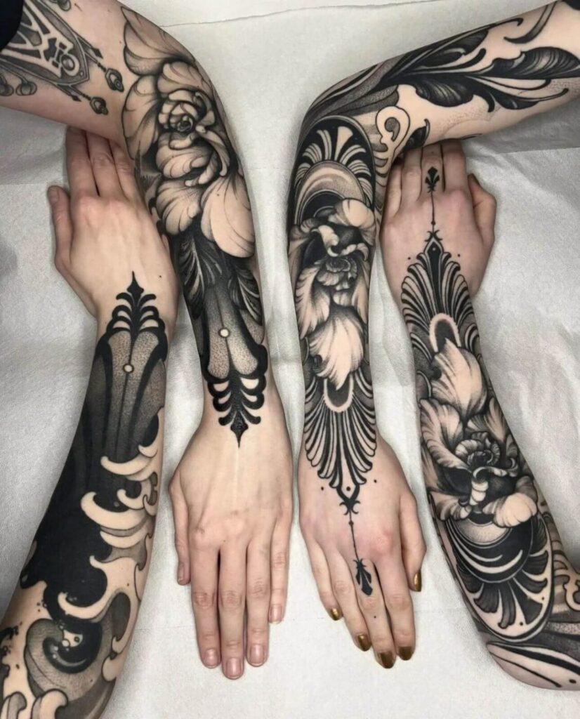
A readable illustrative tattoo has one dominant focal point and a controlled path for the eye. In healed photos, look for:
- Contrast anchor: the darkest Blackwork mass should sit near the focal point, not scattered across the design.
- Rest areas: negative space or low-density Dotwork that lets the eye breathe.
- Directive lines: stems, wings, ribbons or ornamental curves that point toward the subject.
Common failure: two competing focal points of equal contrast. The eye bounces, and the piece feels busy rather than composed. This is frequent in Neo-traditional and Graphic tattoo mashups where every element is rendered at maximum saturation.
Composition Checks on Healed Skin
Flow with anatomy
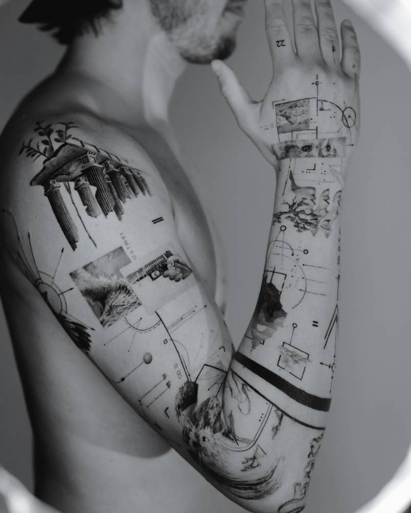
Illustrative designs should follow muscle and joint flow. On a forearm, a vertical botanical stem reads cleanly; a horizontal band of dense Blackwork may distort as the wrist rotates. Ask for healed photos on the same body placement you are considering.
Edge behaviour
Healed edges reveal technique. Clean, intentional borders suggest controlled saturation. Fuzzy or blown edges suggest overworking — a risk in dense Realism and heavy Blackwork. Some softening is normal; widespread blur is not.
Value range
A strong illustrative piece uses a full value range: near-black anchors, mid-tone Dotwork or whip shading, and skin-tone highlights. If everything sits in the mid-grey range, the tattoo will look washed out in five years.
Portfolio Audit Checklist
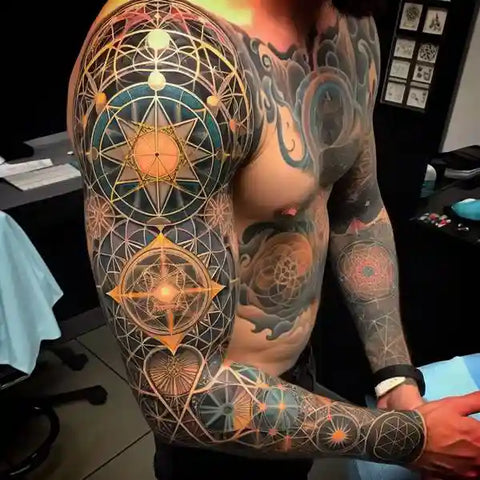
- Are at least half the featured photos healed, not fresh?
- Is there a consistent lighting setup, or are photos filtered to hide contrast loss?
- Can you identify one clear focal point per piece?
- Do lines hold at a normal viewing distance, not just in macro shots?
- Is the shape language consistent across the portfolio?
- Are healed photos dated, so you can judge ageing over time?
- Does the artist show the same style repeatedly, or one lucky example?
If a portfolio is thin on healed evidence, treat that as a caveat, not a disqualifier. Ask directly and see how the artist responds. Our consultation guide covers what to ask.
Style-Specific Healed Risks
Fine line and Micro realism
Thin strokes lose definition first. Check healed photos at two years plus, not two months.
Blackwork and Dotwork
Dense black can spread slightly; dotwork gradients can merge if dots are too close. Look for maintained separation.
Realism and Neo-traditional
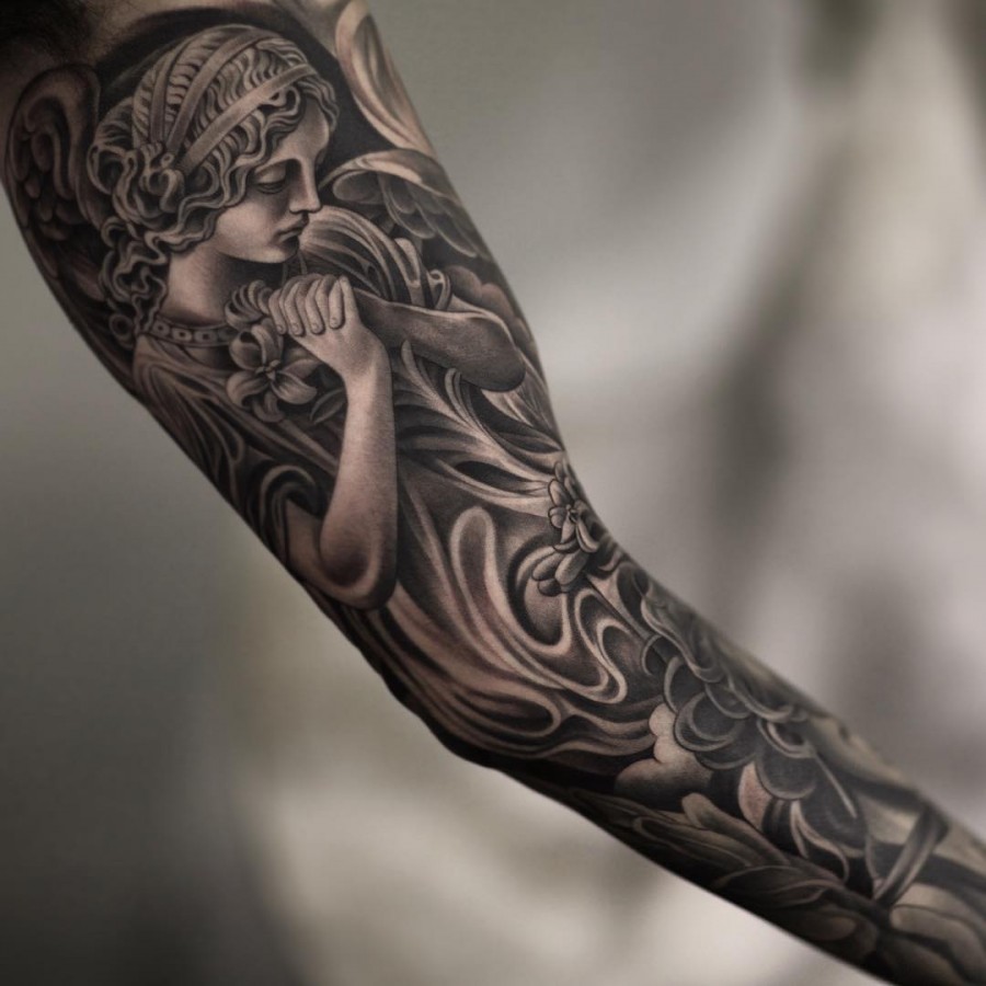
Realism depends on smooth value transitions; Neo-traditional on bold outlines and saturated colour. Healed photos expose whether the artist compensates for skin’s natural softening.
Geometric, Ornamental, Tribal and Lettering
These rely on precision. Healed symmetry and clean line weight are non-negotiable. Lettering must remain legible at reading distance.
Abstract, Graphic and Watercolor
Watercolor can fade unpredictably; Abstract and Graphic work must still hold a readable silhouette without relying on colour alone.
Booking and Safety Questions

- Can I see healed photos of this exact style on this placement?
- How do you plan for softening over time in this design?
- What is your aftercare guidance, and how does it affect healed results?
- Do you offer a review or touch-up policy, and under what conditions?
For pricing context before you commit, use our tattoo price estimator. For studio selection, compare studio profiles and read our magazine features on healed work.
FAQ
How old should healed photos be to be useful?
At least six months, ideally one to three years. Early healed shots show settling; older shots show true ageing.
Can a fresh photo hide composition problems?
Yes. Fresh contrast and redness can mask weak focal hierarchy and thin line structure. Always ask for healed evidence.
Is one strong healed piece enough to judge an artist?
No. Look for a pattern across multiple healed pieces in the same style and placement.
What if the artist has few healed photos?
Ask why, request dated examples, and weigh that against their process and consultation answers. A thin healed portfolio is a real risk for illustrative work.
Content hub
Tattoo styles pillar
This article belongs to the styles cluster. Open the pillar page to compare Irezumi, Old School, Realistic, Blackwork, Fine line, Geometric and Watercolor.
Related reading
Continue reading
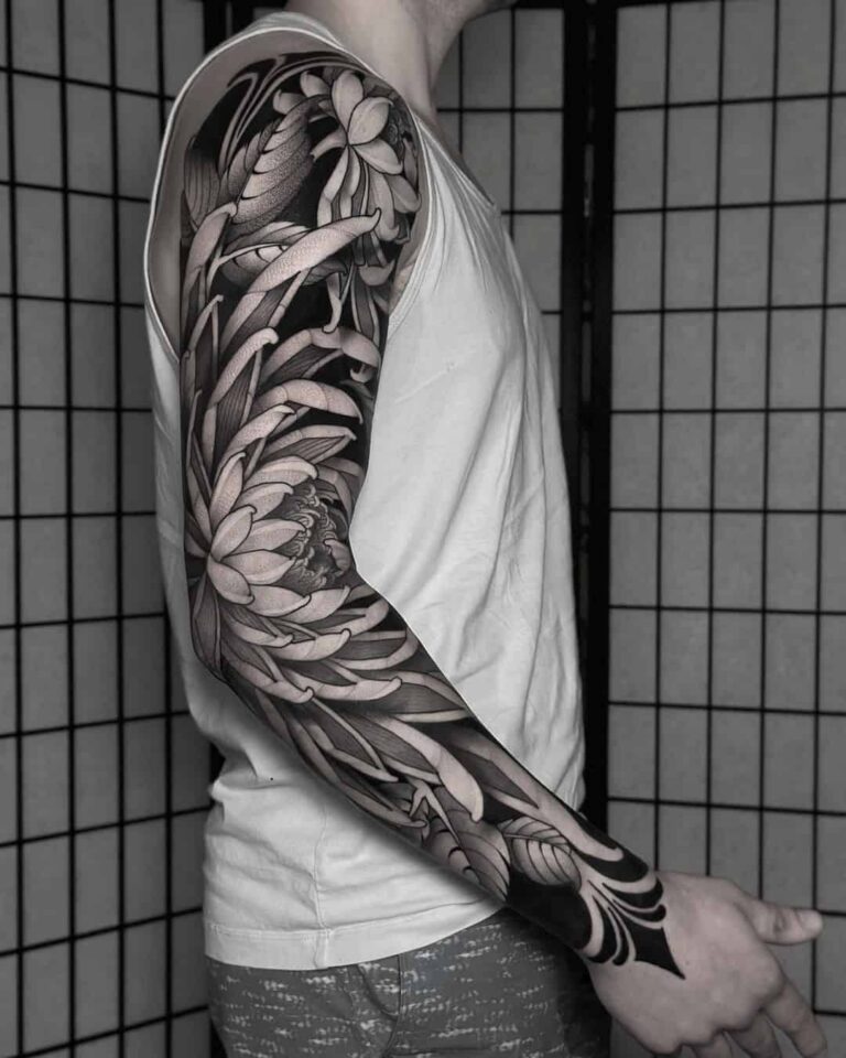
Illustrative Tattoo Placement: Shape Language, Focal Points, and Readable Composition
A specialist guide to illustrative tattoo placement: how shape language, focal hierarchy, negative space, and body-flow determine whether…
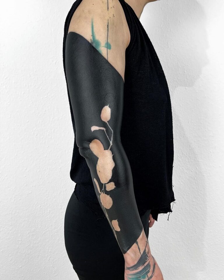
Illustrative Tattoo Design Consultation Checklist: Shape Language, Focal Points and Readable Composition
A specialist consultation checklist for illustrative tattoos: test silhouette readability, define shape language, build focal hierarchy, budget line…
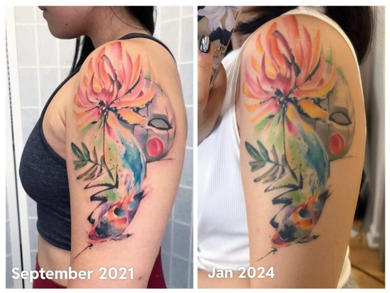
Watercolor Tattoo Healed Portfolio Review: Edge Strategy, Pigment Contrast, and Long-Term Maintenance
A specialist guide to reviewing healed watercolor tattoo portfolios. Learn to assess edge strategy, pigment contrast, and long-term…