
Illustrative Tattoo Design Consultation Checklist: Shape Language, Focal Points and Readable Composition
Why Illustrative Tattoos Fail at Consultation
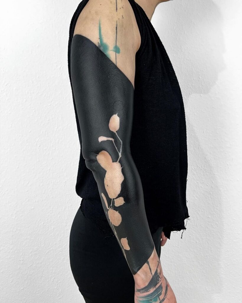
Most disappointing illustrative tattoos are not execution failures. They are consultation failures. The drawing was beautiful on a tablet, the stencil looked fine, and six months later the piece reads as a grey smear because nobody checked shape language, focal hierarchy or silhouette at the size the client actually wanted. An illustrative tattoo is a picture that has to survive skin, hair, movement, ageing and distance. That is a design problem before it is a needle problem.
This checklist is for clients and artists who want the consultation to do the heavy lifting. It assumes you already know you want an illustrative piece, not a generic style sampler. If you are still choosing between approaches, start with our magazine guides and then come back with a shortlist.
1. Define the Readable Silhouette First
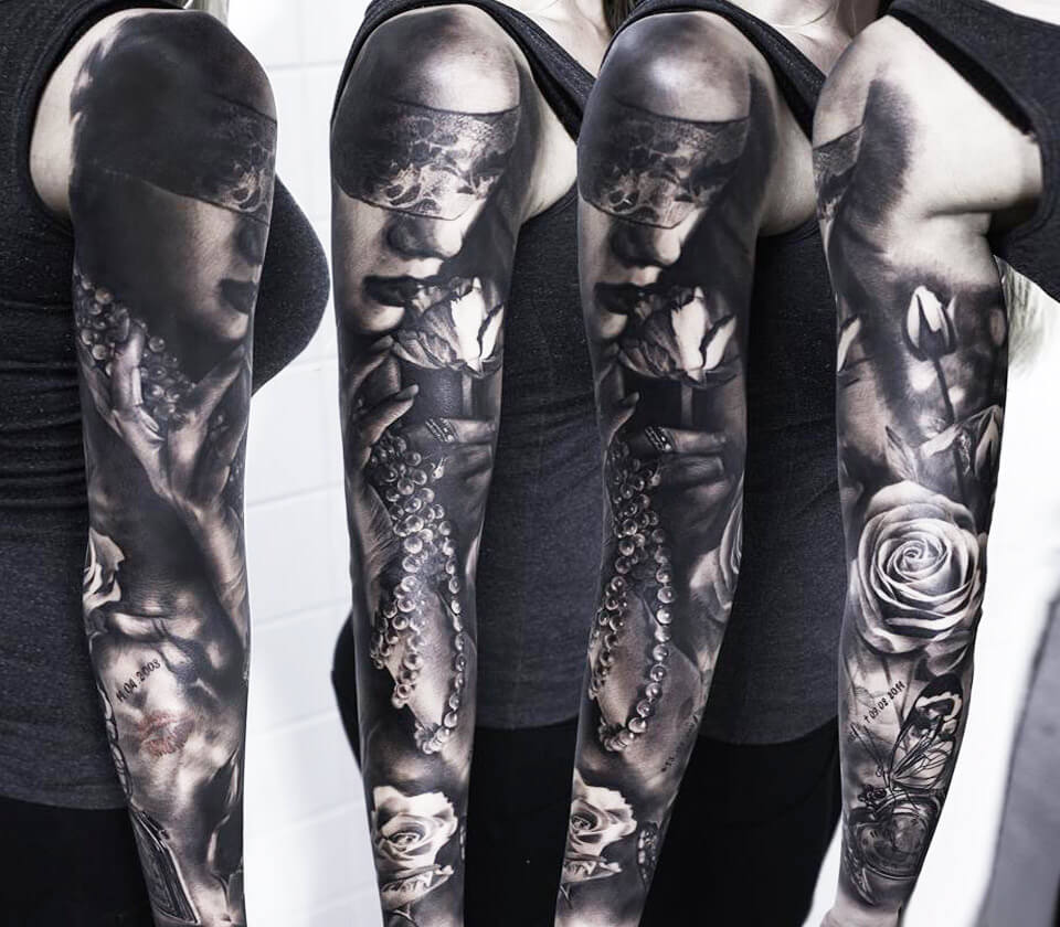
Before line weight, before colour, before shading, ask one question: does the outer shape read at arm’s length? Squint at the reference. If the silhouette collapses into a blob, the composition is not ready.
- Fill the black shape mentally. A strong illustrative design still reads as a solid black mass. If it only works because of internal detail, it will fail on skin.
- Check negative space. Gaps between elements should be deliberate, not accidental. Fine line work with no breathing room turns into a grey field.
- Test three sizes. Print the reference at the intended size, at 70% and at 50%. The piece should still communicate at 70%. If it dies at 70%, you are over-detailing.
Shape language: what your geometry is saying
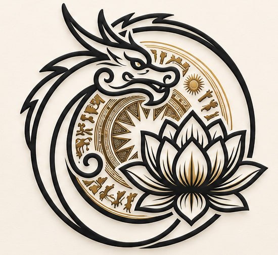
Shape language is the emotional grammar of the design. Rounded, organic contours read soft and calm. Angular, fractured shapes read tense and graphic. Repetition of one shape family creates cohesion; mixing three families creates noise.
- Circles and ovals: protective, contained, classical. Common in Ornamental and Neo-traditional framing.
- Triangles and wedges: directional, aggressive, structural. Useful in Geometric tattoo and Graphic tattoo composition.
- Flowing S-curves: organic movement, botanical, water. Natural fit for Japanese traditional and Watercolor tattoo motifs.
- Hard rectangles: architectural, modern, editorial. Often paired with Lettering or Abstract tattoo panels.
Ask the artist to name the dominant shape family in your reference. If they cannot, the design has no spine yet.
2. Build a Focal Point Hierarchy
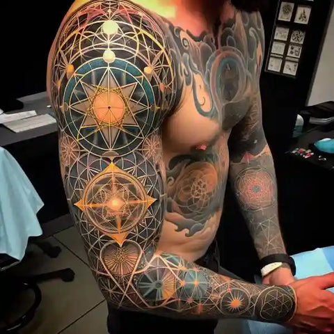
Every illustrative tattoo needs one primary focal point, at most two secondary ones, and a clear background layer. Without hierarchy, the eye has nowhere to land.
Primary focal point
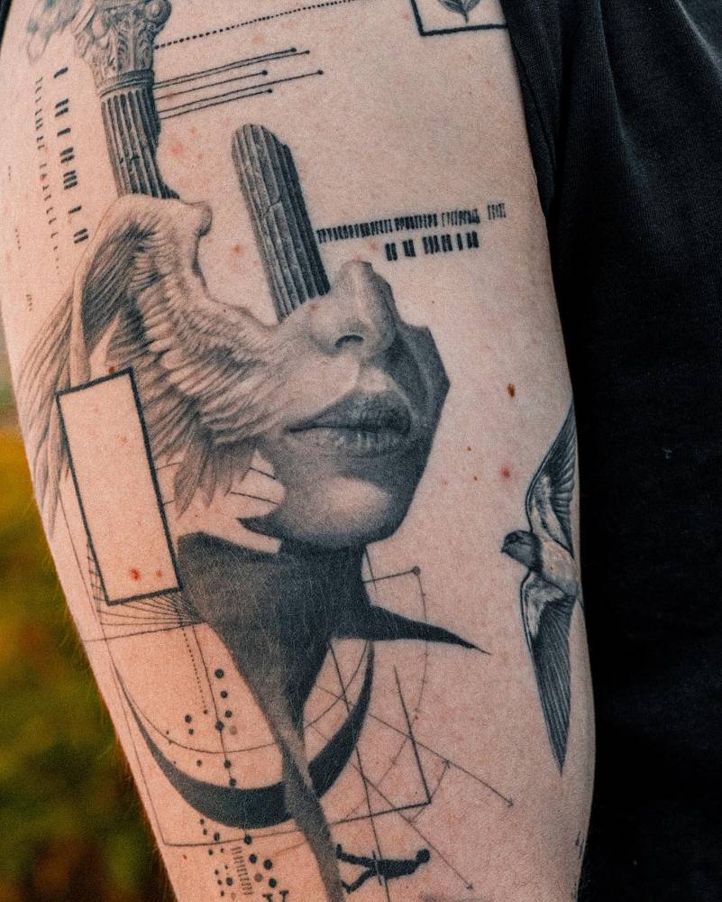
This is the highest-contrast, highest-detail area: a face, an eye, a hand, a single bloom. In Realism and Micro realism, the focal point is usually the eye or the mouth. In Blackwork and Dotwork, it is the densest cluster of marks.
Secondary focal points
These support the story without competing. A secondary element should sit at lower contrast, smaller scale or softer edge than the primary. If two elements fight for attention, the tattoo looks busy rather than rich.
Background and atmosphere
Background is not filler. It controls depth. Options include soft gradient shading, stippled atmosphere, geometric framing, or deliberate empty skin. Empty skin is a legitimate background layer and often the strongest one.
3. Composition Checks for Readable Placement
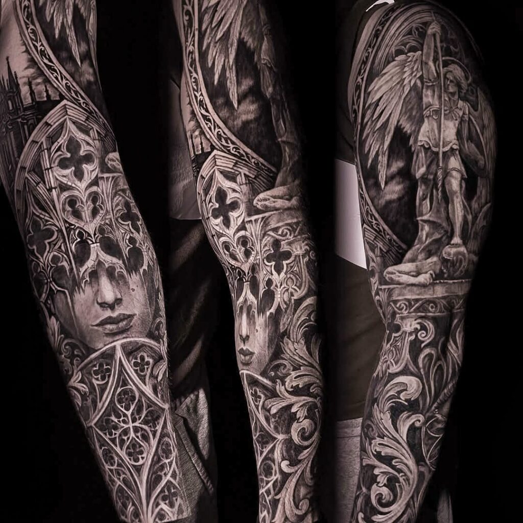
Composition is not only about the drawing. It is about the drawing on a moving, curved body.
- Flow with the limb. Long vertical elements should follow the limb axis, not cut across it.
- Anchor the base. Designs that float without a visual base look unfinished. A grounding element, even a subtle shadow, helps.
- Respect the joint. Detail placed directly over a joint will distort with movement. Keep high-detail zones on flatter planes.
- Plan the crop. Decide what happens at the edges. Hard crop, soft fade or framed border are three different design decisions.
- Check the wrap. On a curved surface, the far side of the design will be seen at an angle. Rotate the reference and check it still reads.
4. Line Weight, Contrast and Detail Budget
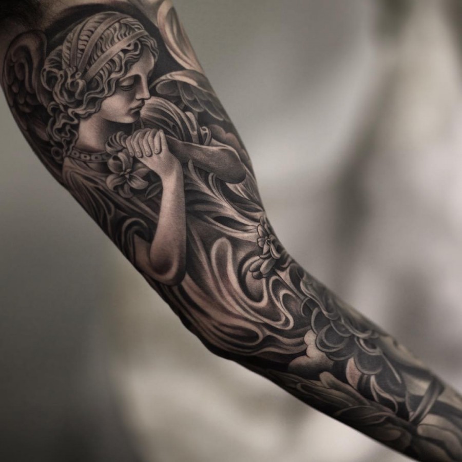
Illustrative work lives or dies on line weight discipline. A common mistake is uniform line weight across the whole piece, which flattens the image.
- Thick outer contour, thinner interior lines. This creates depth and separates the subject from the background.
- Fine line accents belong in secondary detail, not in structural edges that need to hold for years.
- Dotwork gradients are excellent for soft transitions but require spacing discipline. Dots too close together merge into grey.
- Blackwork masses give the piece its graphic punch. Use them to frame, not to fill every gap.
- Detail budget: the smaller the tattoo, the fewer the details. Micro realism at a small scale demands ruthless simplification.
If you want a realistic cost conversation before committing, use our tattoo price estimate tool as a planning baseline, then confirm the final quote with the artist.
5. Style-Specific Consultation Notes
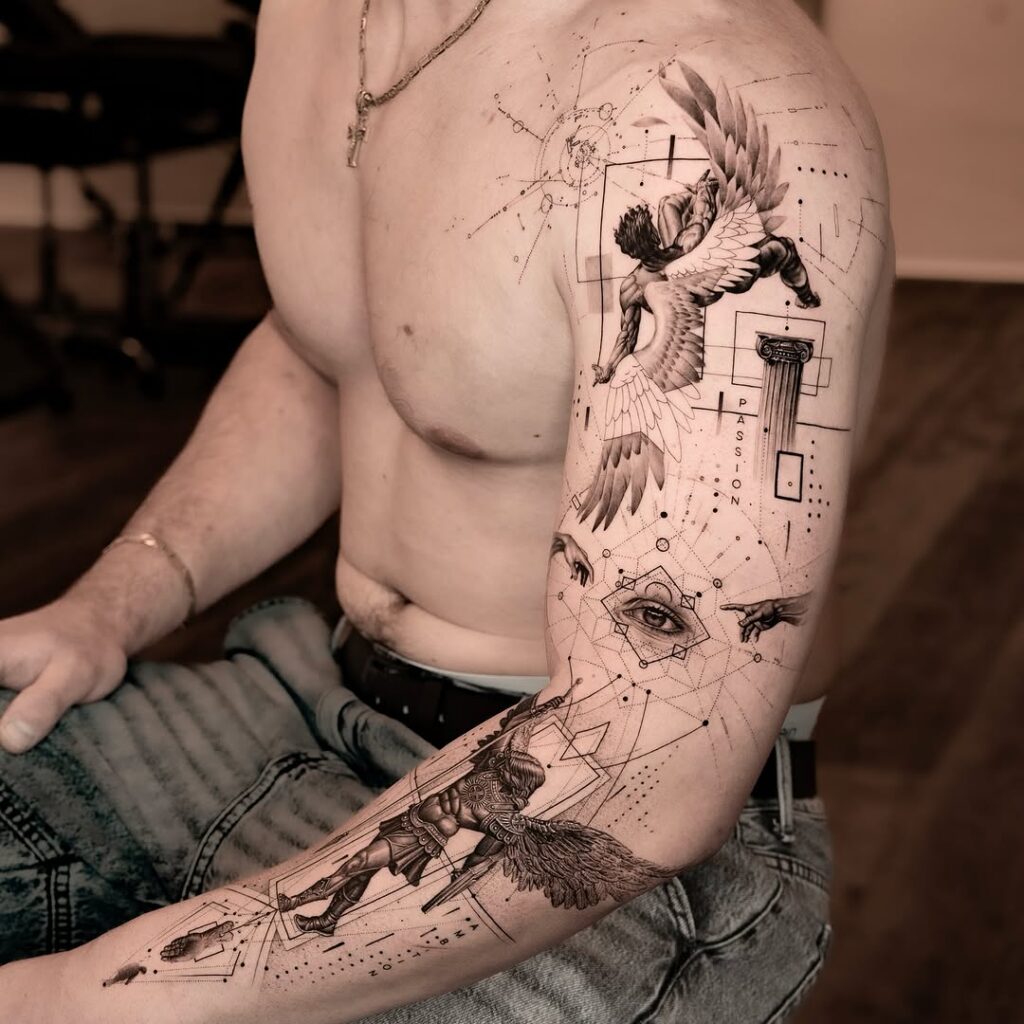
Fine line and Micro realism
Ask how the artist plans to maintain legibility as lines soften over time. Discuss spacing between fine lines and whether the design can be simplified without losing the focal point.
Blackwork, Dotwork and Tribal
These rely on silhouette and negative space. Confirm that the black masses have a clear shape purpose and that the negative space is intentional, not leftover.
Realism and Neo-traditional
Realism needs a clear light source. Neo-traditional needs a clear decorative frame. Ask where the light is coming from and how the frame interacts with the subject.
Geometric, Abstract and Graphic tattoo
These styles are unforgiving about alignment. Check symmetry, grid consistency and whether the geometric elements support the illustrative subject or compete with it.
Japanese traditional and Ornamental
Both have strong compositional traditions. Ask how the artist is adapting the traditional structure to your body placement rather than copying a flash sheet.
Watercolor and Lettering
Watercolor needs planned colour bleed and contrast anchors. Lettering needs hierarchy: one dominant word or phrase, supporting text at lower weight, and enough spacing to stay readable.
6. Consultation Checklist You Can Actually Use
- Bring three references: one for subject, one for shape language, one for contrast or mood.
- Confirm the intended size and placement before the artist starts drawing.
- Ask for a silhouette test at 70% scale.
- Identify the primary focal point out loud.
- Confirm the line weight plan: outer contour versus interior lines.
- Discuss the background layer: shading, framing or empty skin.
- Ask how the design will age in five and ten years.
- Confirm whether the piece will be completed in one session or staged.
- Ask about aftercare instructions and when to expect settling.
- Get the final quote and deposit terms in writing.
For matching with artists who work in your preferred style, browse ranked artist profiles and verified studio listings. If you want a second opinion on the design direction, a consultation session can save you from a costly cover-up later.
7. Booking and Safety Questions Worth Asking
- Can I see healed photos of similar illustrative work, not just fresh tattoos?
- How do you handle revisions to the drawing before the appointment?
- What is your policy if the design needs to be resized on the day?
- Do you work in stages for larger illustrative pieces?
- What aftercare products and routines do you recommend for this specific style?
- How should I prepare on the day: sleep, food, hydration, clothing?
Safety questions should stay practical. Ask about hygiene standards, single-use equipment and the studio’s licensing. Do not ask for medical advice from an artist; for skin conditions, allergies or medication questions, speak to a qualified healthcare professional.
FAQ
How do I know if my illustrative tattoo design is too detailed?
Run the 70% test. Print the design at 70% of the intended size and view it from a normal conversation distance. If the focal point disappears or the internal details merge, the design is over-detailed for that scale.
What is the most important composition rule for illustrative tattoos?
Focal hierarchy. One primary focal point, secondary elements at lower contrast, and a deliberate background layer. Without hierarchy, even a technically well-executed tattoo reads as visual noise.
Should I choose Fine line or Blackwork for an illustrative piece?
It depends on the subject and the lifespan you expect. Fine line suits delicate, low-contrast subjects but needs careful spacing. Blackwork holds contrast and silhouette better over time, especially for bold graphic subjects.
Can I combine Geometric tattoo elements with an illustrative subject?
Yes, but the geometric elements must support the focal point rather than compete with it. Use geometry as a frame, a background grid or a directional guide, and keep the illustrative subject as the primary read.
Read more
- Magazine for more tattoo knowledge, style guides and aftercare notes.
- Request a consultation if you need help with style, placement or preparation.
- Marketplace for equipment, supplies and learning resources.
Content hub
Tattoo styles pillar
This article belongs to the styles cluster. Open the pillar page to compare Irezumi, Old School, Realistic, Blackwork, Fine line, Geometric and Watercolor.
Related reading
Continue reading
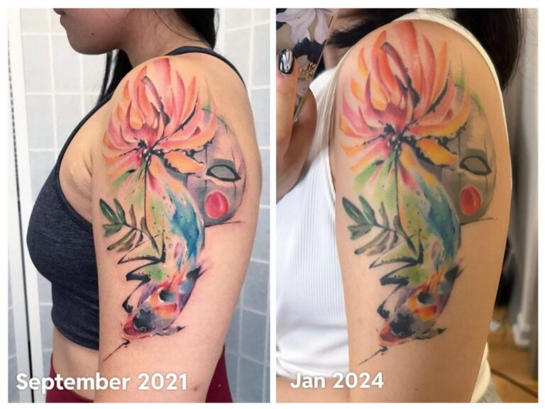
Watercolor Tattoo Healed Portfolio Review: Edge Strategy, Pigment Contrast, and Long-Term Maintenance
A specialist guide to reviewing healed watercolor tattoo portfolios. Learn to assess edge strategy, pigment contrast, and long-term…
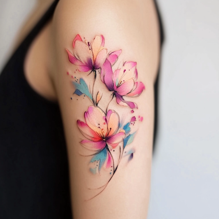
Watercolor Tattoo: Placement, Body-Flow, Edge Strategy, Pigment Contrast, and Long-Term Maintenance
A specialist guide to watercolor tattoo placement and body-flow. Learn edge strategy, pigment contrast checks, long-term maintenance, and…

Watercolor Tattoo Design Consultation Checklist: Edge Strategy, Pigment Contrast, and Long-Term Maintenance
A specialist guide to watercolor tattoo consultations, covering edge strategy, pigment contrast, and long-term maintenance. Includes checklists and…