Black and Grey Tattoo Placement & Body-Flow: A Specialist’s Guide to Value, Gradient, and Long-Term Contrast
Why Placement Is a Black and Grey Decision
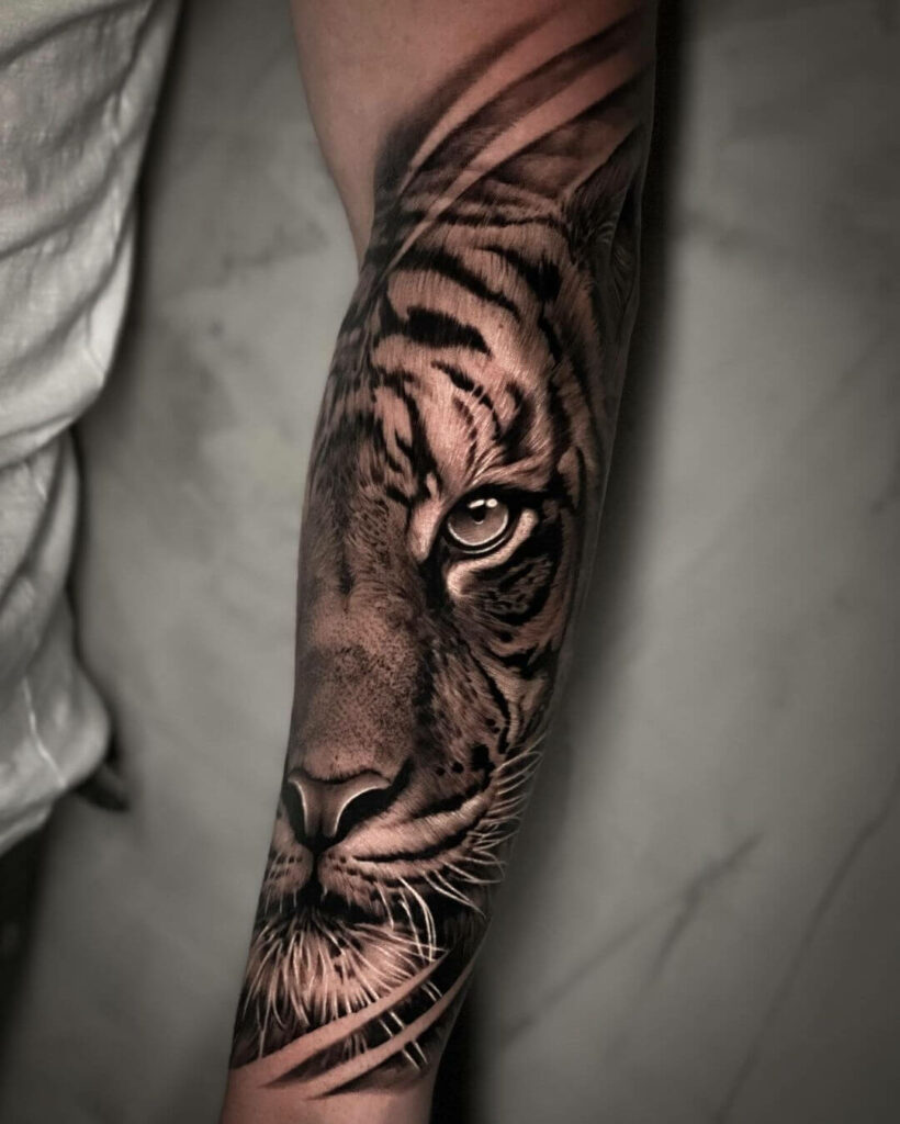
In black and grey tattooing, the design is only half the equation. The other half is how the ink sits on the body—how light falls, how skin moves, and how the piece ages. Unlike colour work, where hue can distract, black and grey relies entirely on value range and smooth gradients. A placement that fights the body’s natural contours will flatten your tattoo, no matter how skilled the artist. This guide is for clients who want a piece that flows with their anatomy and holds contrast for decades.
Value Range and Skin Tone: The First Filter
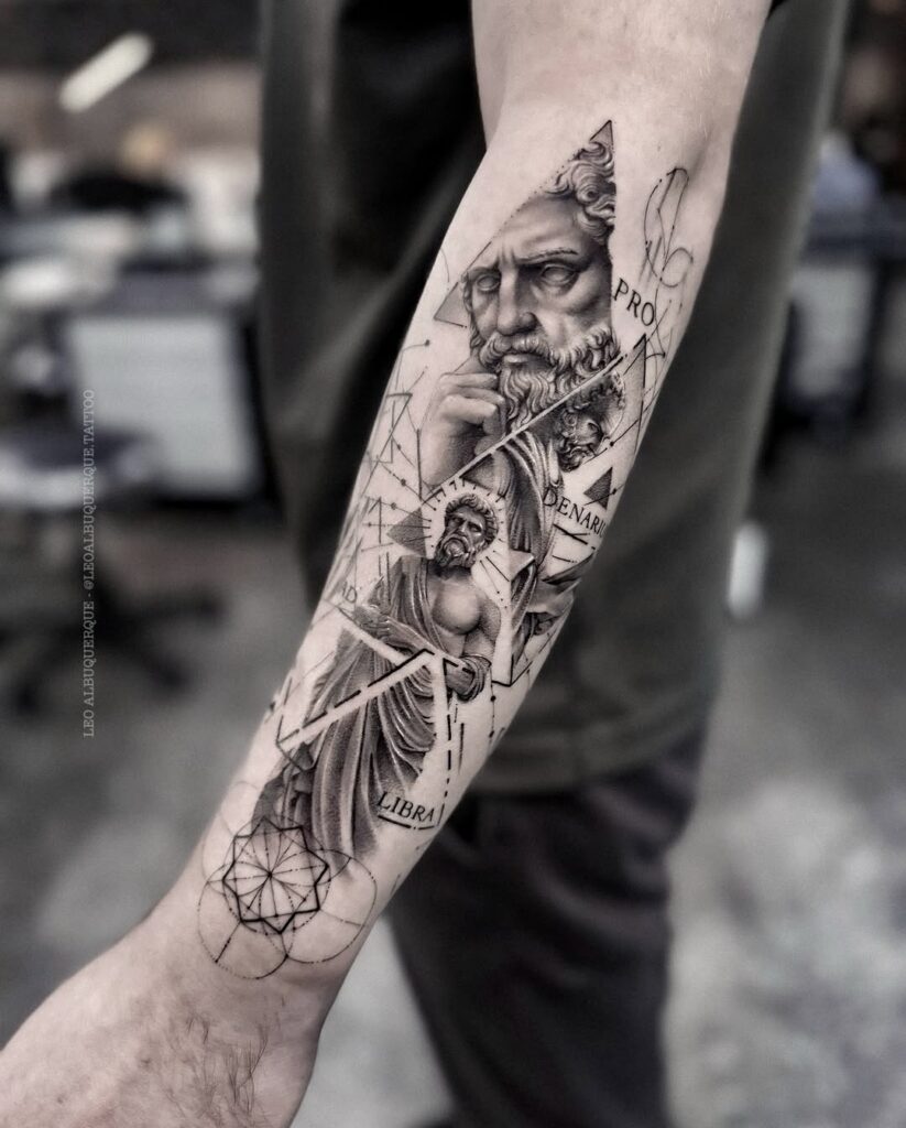
Before choosing a spot, understand your canvas. Black and grey works on all skin tones, but the value range—from pale grey to solid black—must be adjusted. On deeper skin, the artist needs to push contrast higher, using more negative space and bolder mid-tones. On fair skin, subtle gradients are easier, but watch out for sun damage. Ask your artist: “How will this design’s value range hold on my skin tone?” If they can’t answer with specifics, walk away.
Checklist: Skin and Value
- Bring reference photos of healed black and grey tattoos on similar skin tone.
- Discuss the darkest black you’re willing to commit to—it will be permanent.
- Ask about grey wash dilution ratios (e.g., 3:1, 5:1) and how they plan to build depth.
- If you have scars or stretch marks, mention them—they affect ink absorption.
Body-Flow: Reading the Natural Lines
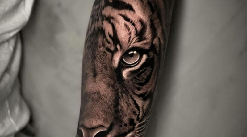
Body-flow means aligning the tattoo’s composition with the body’s muscle structure and movement. A common mistake is placing a static design over a dynamic area. For example, a straight-edged geometric tattoo on the bicep will warp with every flex. Instead, let the design curve around the muscle belly. For a Realism or Micro realism piece, the placement should follow the largest flat area available—like the outer forearm or thigh—so the image doesn’t distort.
Key Zones and Their Flow
- Forearm: Great for vertical designs; the ulna line creates a natural spine. Avoid wrapping around the radius if you want clean edges.
- Upper arm: The deltoid offers a curved canvas—ideal for Ornamental or Blackwork that follows the muscle.
- Ribs and side: These move a lot; designs with strong outlines (like Japanese traditional) hold better than subtle gradients.
- Thigh: A stable, large area—perfect for Graphic tattoo or Abstract tattoo compositions that need space.
- Back of neck: Small, low-movement spot—good for Lettering or a tiny Dotwork piece.
Smooth Gradients: The Technical Core
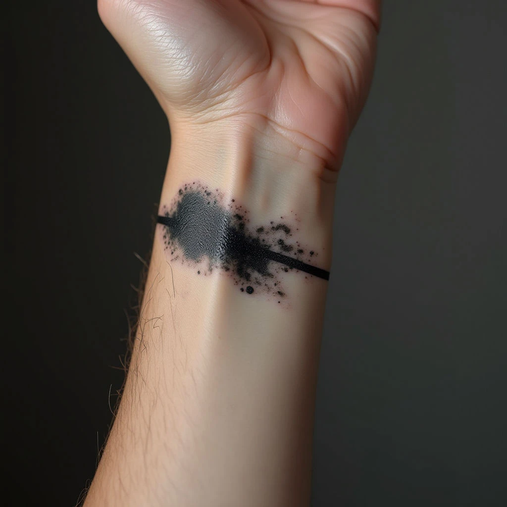
Smooth gradients are the soul of black and grey. They require the artist to pack black at different densities and blend with water or grey wash. Placement affects how you perceive the gradient. On a curved surface, like a shoulder cap, the gradient can wrap—creating a 3D effect. On a flat surface, like the shin, gradients are more straightforward but need more passes to avoid patchiness.
Ask your artist: “How many passes will you do on the gradient?” A good artist will use multiple passes, letting the skin heal between sessions if necessary. Avoid artists who promise a full gradient in one sitting—it often leads to overworked skin and muddy tones.
Gradient Checklist
- Request a small test gradient on a hidden spot (e.g., inner arm) to see how your skin holds the ink.
- Check for smooth transitions—no visible “step” between grey tones.
- Ensure the darkest area has a solid black base—this is what will last.
- Ask about touch-up policy for gradient work—most need one.
Long-Term Contrast: Planning for 10+ Years
Black and grey tattoos age differently depending on placement. High-friction areas (hands, feet, inner elbows) fade faster. Sun exposure is the biggest enemy—UV breaks down ink particles, making grey areas blur. For long-term contrast, place the design where you can protect it with clothing or sunscreen. Also, consider the “blur factor”: fine lines and subtle gradients will soften over time. A bold Neo-traditional piece with heavy black shading will hold better than a delicate Watercolor tattoo (though watercolour is rarely black and grey).
Planning for Age
- Choose a spot that’s easy to cover with sleeves or pants if you work outdoors.
- Keep the design’s core shapes bold—thin lines may need touch-ups.
- Discuss with your artist how the piece will look in 20 years. They should be honest.
- If you’re over 40, skin elasticity changes—avoid areas that will sag dramatically.
Placement by Style: Matching Intent
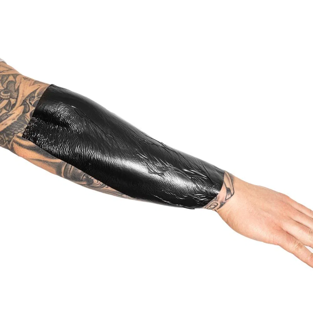
Different black and grey styles demand specific placements. Here’s a quick guide:
- Fine line: Best on low-movement areas like the inner forearm or collarbone—lines stay crisp.
- Dotwork: Works well on large flat areas (thigh, back) where the dots can create texture.
- Realism: Needs a stable, flat canvas—chest, thigh, or upper back.
- Geometric tattoo: Use body landmarks (like the spine or sternum) to align symmetry.
- Japanese traditional: Follows the body’s flow—often wraps around shoulders or ribs.
- Lettering: Place along a muscle line (e.g., forearm) to avoid distortion.
Booking and Safety: Questions to Ask
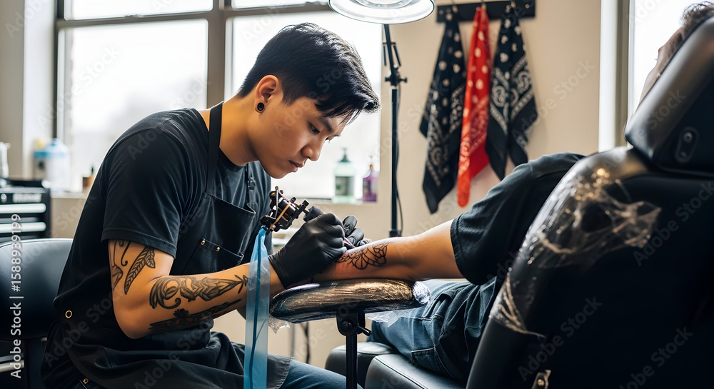
Before you book, ask these questions to ensure your placement decision is sound:
- “Have you tattooed this exact area before? Can I see healed photos?”
- “What’s your approach to grey washes on my skin tone?”
- “How will the design move if I gain/lose weight?”
- “Do you offer a free consultation for placement advice?”
Never rush. A good placement is a collaboration—you know your body, the artist knows the craft. Use our cost estimator to budget for a piece that respects your anatomy.
FAQ
1. How do I choose between a forearm and upper arm placement for a black and grey piece?
Forearm is better for vertical designs and easy visibility; upper arm offers a curved canvas that flows with the deltoid. If you want a piece that moves with your muscle, choose upper arm. For a stable, straight design, forearm wins.
2. Will a black and grey tattoo on my ribs fade faster?
Yes, ribs are high-friction and see a lot of movement, which can cause faster fading. Opt for bolder designs with strong outlines. Regular touch-ups will be needed.
3. Can I get a smooth gradient on my ankle?
Ankles have thin skin and lots of movement, making smooth gradients tricky. The artist may need to do multiple sessions. It’s possible, but expect a longer healing process and a higher chance of blowouts.
4. What’s the best placement for a first black and grey tattoo?
Outer forearm or upper arm are ideal—they’re easy to care for, have stable skin, and you can see the piece. Avoid hands, neck, or ribs for your first—they’re more painful and heal harder.
For more inspiration, check our tattoo magazine or browse verified studios to find an artist who specialises in black and grey. If you’re still unsure, use our consultation tool to get personalised advice.
Read more
- Magazine for more tattoo knowledge, style guides and aftercare notes.
- Request a consultation if you need help with style, placement or preparation.
- Marketplace for equipment, supplies and learning resources.
Content hub
Tattoo styles pillar
This article belongs to the styles cluster. Open the pillar page to compare Irezumi, Old School, Realistic, Blackwork, Fine line, Geometric and Watercolor.
Related reading
Continue reading
Lettering Tattoo Healed Portfolio Review: Kerning, Baseline & Placement Distortion
A specialist healed-portfolio review guide for Lettering tattoos, focused on kerning, baseline control and placement distortion. Includes concrete…
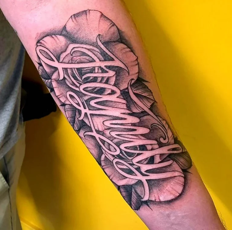
Lettering Tattoo Placement: A Specialist Guide to Kerning, Baseline Control, and Body-Flow Distortion
A specialist guide to lettering tattoos focusing on kerning, baseline control, and placement distortion. Learn how to plan…

Lettering Tattoo Design Consultation Checklist: Kerning, Baselines, and Placement Distortion
A specialist consultation checklist for lettering tattoos covering kerning, baseline control, and placement distortion. Includes practical tests, booking…