
The Art of Lettering and Script Tattoos: Kerning, Spacing, Placement & Aging
Introduction: Why Lettering Tattoos Demand Precision
Lettering and script tattoos are among the most personal forms of body art. A single word, a meaningful phrase, or a date can carry deep significance. But unlike pictorial tattoos, lettering relies entirely on typography—every curve, gap, and alignment matters. A poorly kerned word can become illegible; a cramped phrase may blur into a blob over time. This guide covers the critical elements of font choice, spacing, placement, and aging to ensure your lettering tattoo remains crisp and beautiful for decades.
Font Choice: The Foundation of Readability
Serif vs. Sans Serif
Serif fonts (like Times New Roman) have small decorative strokes at the ends of letters. They can feel classic and elegant but may blur faster as the ink spreads with age. Sans serif fonts (like Helvetica) are cleaner and often age better due to simpler shapes. For small text, sans serif is usually safer.
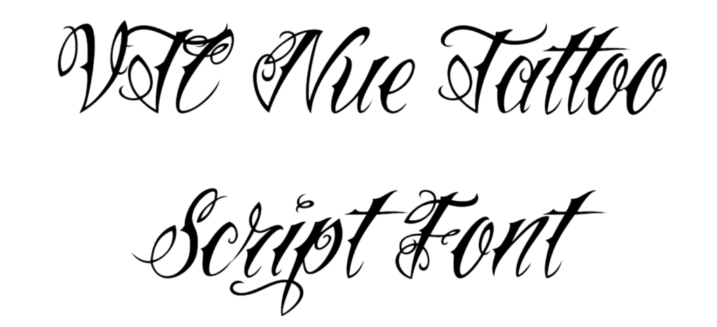
Script and Cursive
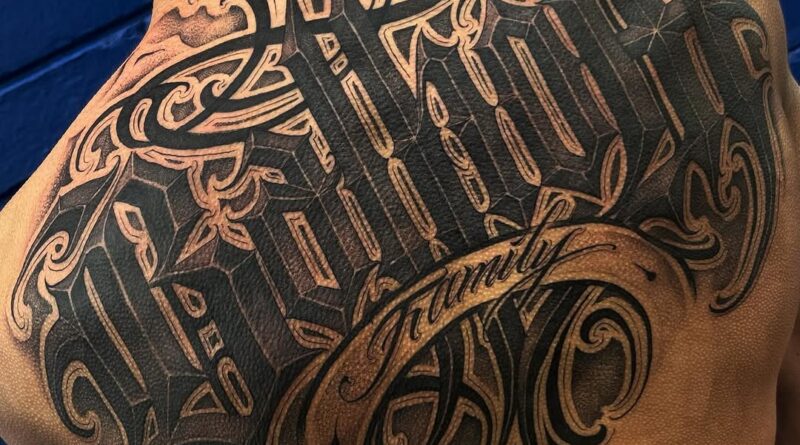
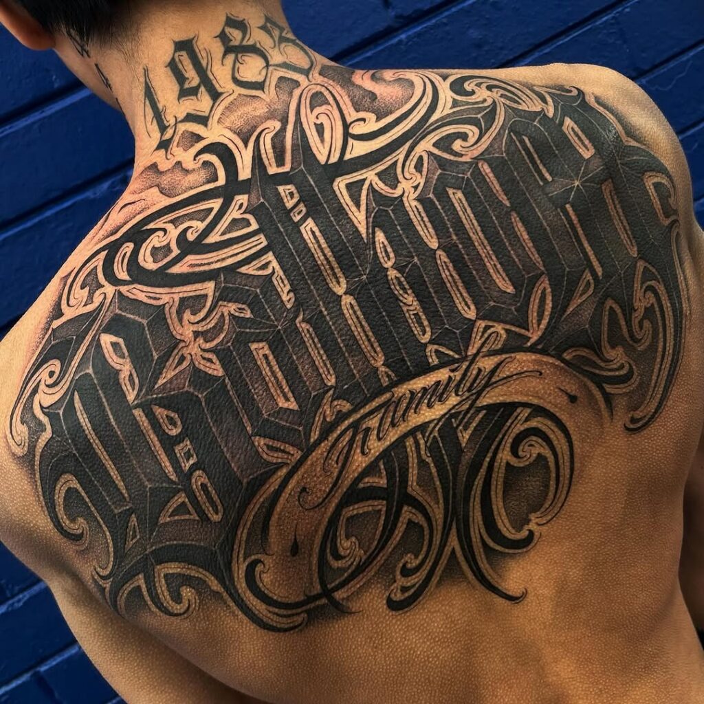
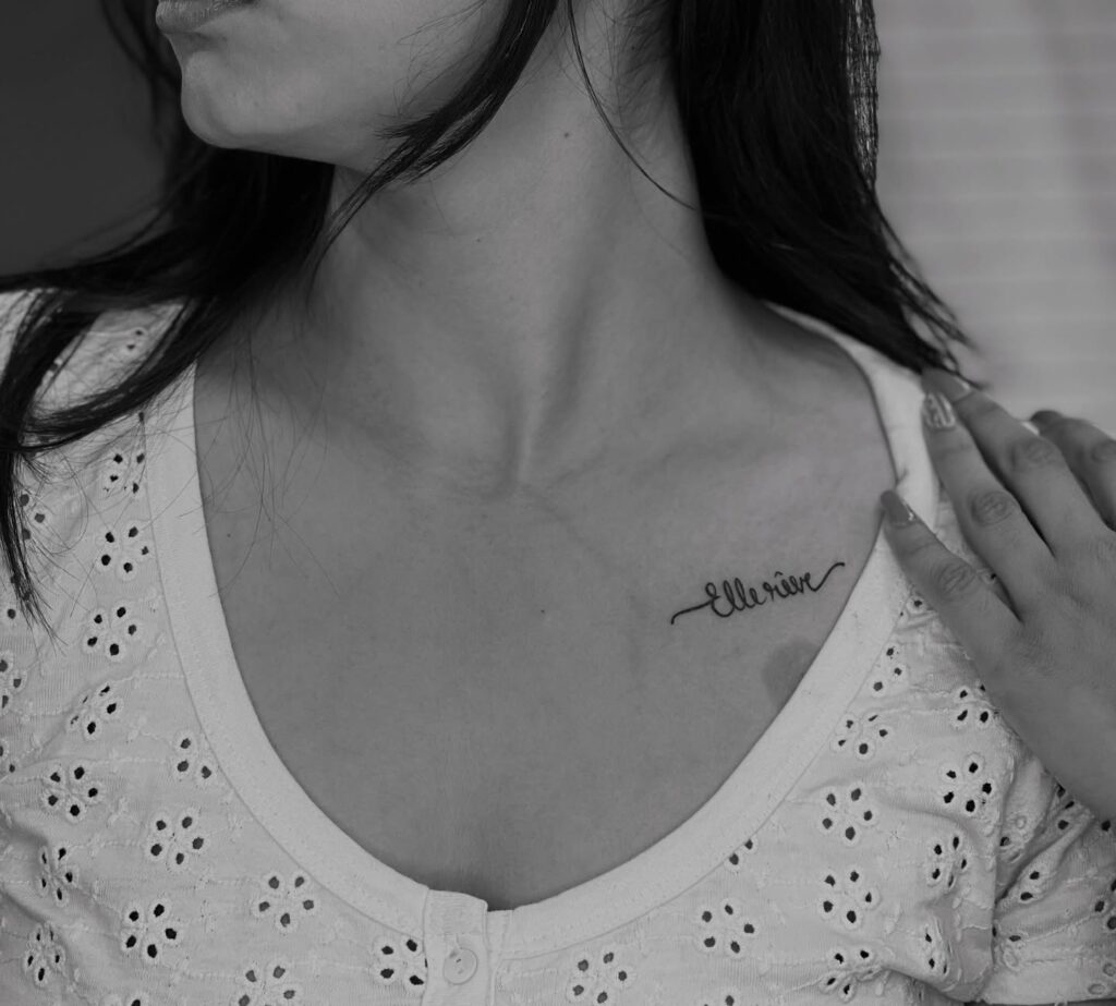
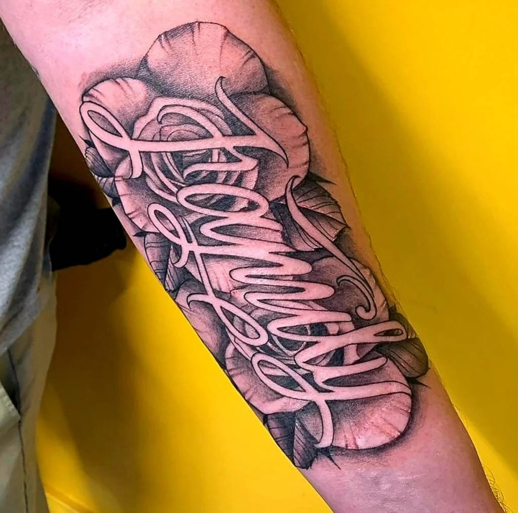
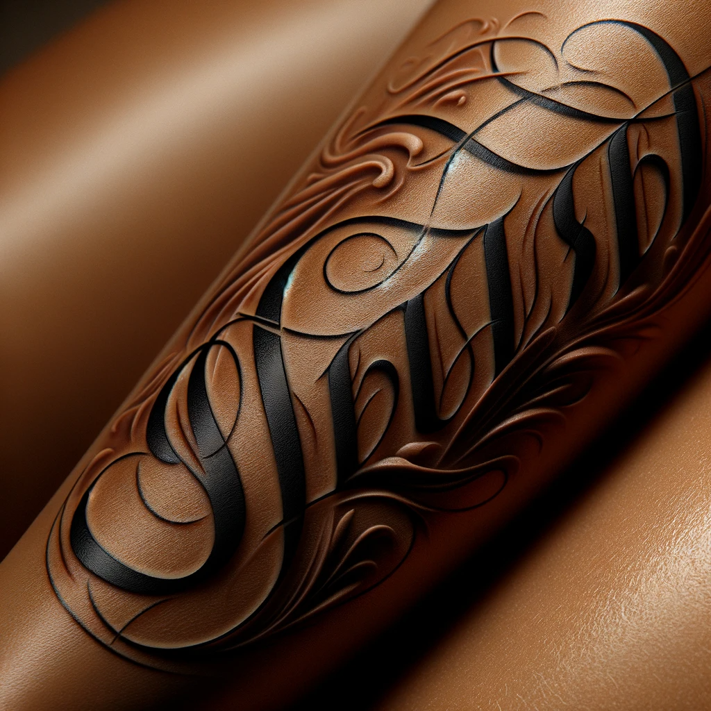
Flowing script fonts are popular for romantic quotes. However, intricate loops and thin strokes can become muddled. Choose a script with moderate thickness and avoid overly delicate flourishes. A skilled tattoo artist can adjust the design to improve longevity.
Custom Lettering
Many artists offer custom-drawn lettering. This ensures the spacing and proportions are tailored to your body placement. Custom work often ages better because the artist considers the skin’s movement and ink spread.
Kerning and Spacing: The Secret to Legibility
Kerning refers to the space between individual letters. In tattoos, proper kerning prevents letters from touching or appearing uneven. Too tight, and the word becomes a dark smear; too loose, and it looks disconnected.
- Check letter pairs: Common problem pairs like “AV”, “WA”, or “rn” can look like “m” if too close.
- Use a mock-up: Ask your artist for a stencil on transparent paper. Place it on your skin and inspect from a normal viewing distance.
- Consider negative space: The empty area inside letters (e.g., the loop in ‘e’) should be clear and not fill in.
Phrase Length: Less Is Often More
Long sentences rarely work well as tattoos. Skin stretches and ink spreads, reducing readability. A phrase of 3–5 words is optimal. If you must include a longer quote, break it into multiple lines with thoughtful line breaks.
Line Breaks and Hierarchy
Use line breaks to create visual rhythm. The most important word should be largest or boldest. Avoid breaking a word across two lines.
Placement: Anatomy Matters
Placement affects how the tattoo ages and how it looks with body movement. High-movement areas (like ribs, biceps, or wrists) can distort lettering over time.
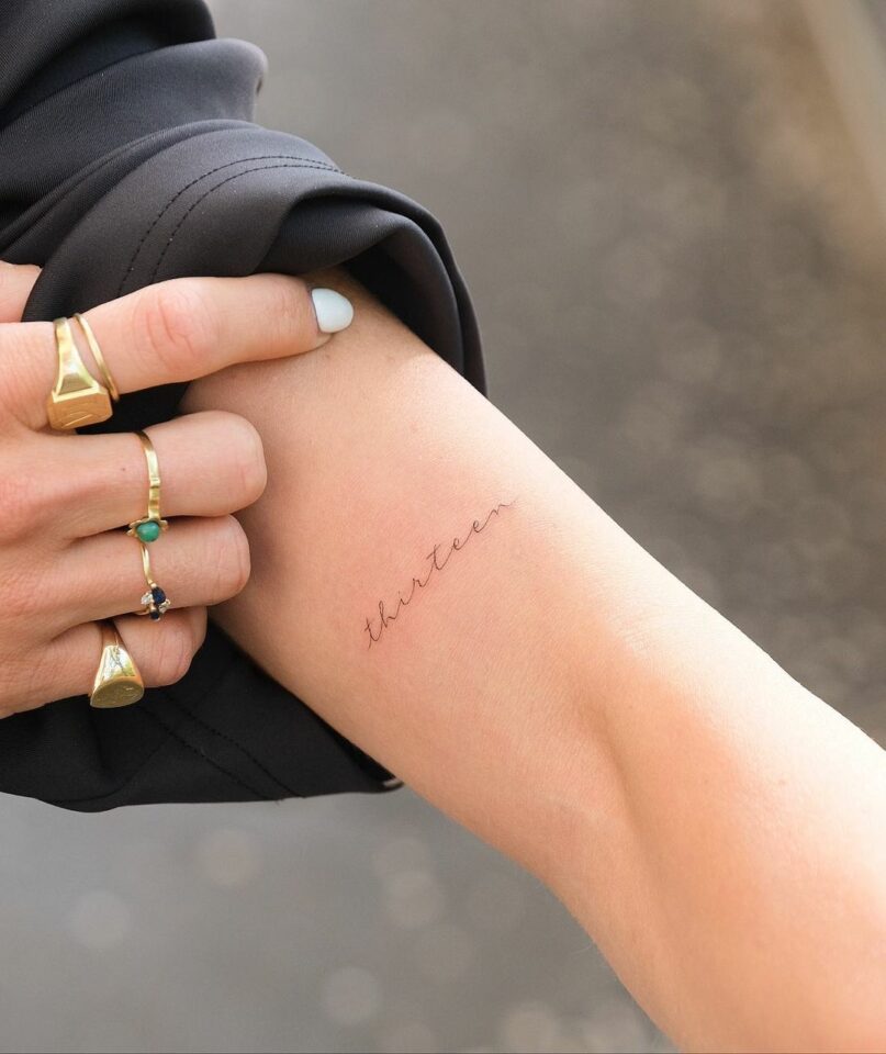
- Forearm: A popular spot, but the inner forearm is better than the outer because it sees less sun and movement.
- Ribs: Skin here stretches significantly—lettering may warp. Keep phrases short and fonts bold.
- Wrist/Ankle: Small areas limit font size. Avoid thin scripts; they’ll blur quickly.
- Back/Shoulder: Flatter, less mobile skin is ideal for longer text.
Aging: What to Expect
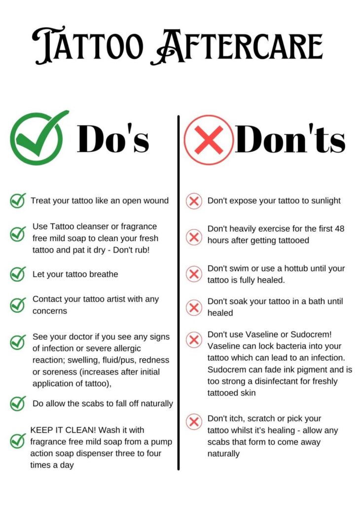
Tattoo ink spreads slightly under the skin over years. This is normal. Fine lines may thicken, and tiny gaps may close. To slow aging:
- Sun protection: UV rays accelerate ink fading and spreading. Use SPF 50+.
- Moisturize: Healthy skin holds ink better.
- Touch-ups: After 5–10 years, a touch-up can sharpen blurred edges.
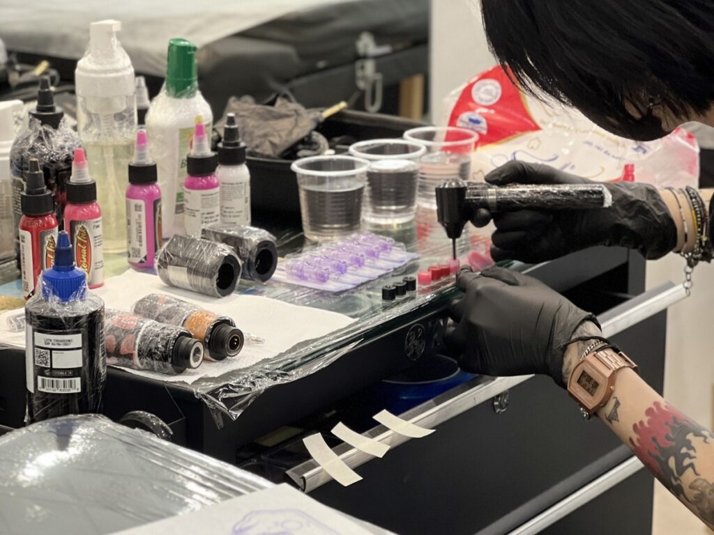
Comparison: Hand-Poked vs. Machine Lettering
Hand-poked (stick-and-poke) creates softer lines that may age more diffusely. Machine lettering is crisper initially. For precise lettering, machine is usually recommended.
FAQ
1. Can I use a font from the internet?
Yes, but the artist must adapt it for tattooing. Many fonts have fine details that won’t hold up. Always consult your artist before choosing a font.
2. How small can lettering be?
For readability, avoid letters smaller than 1 cm (about 0.4 inches) in height. Smaller sizes risk blurring into illegibility.
3. Does placement affect pain?
Yes. Bony areas (ribs, collarbone) hurt more. Fleshy areas (outer arm, thigh) are less painful. But pain shouldn’t dictate placement—legibility and aging are more important.
4. How do I find a good lettering artist?
Look at their portfolio specifically for script tattoos. Check that the lines are clean, spacing even, and healed photos are available. Read reviews on verified studio profiles and consult via tattoo consultation.
For more inspiration, explore our tattoo magazine and rankings of top artists.
Read more
- Magazine for more tattoo knowledge, style guides and aftercare notes.
- Request a consultation if you need help with style, placement or preparation.
- Marketplace for equipment, supplies and learning resources.
Content hub
Tattoo styles pillar
This article belongs to the styles cluster. Open the pillar page to compare Irezumi, Old School, Realistic, Blackwork, Fine line, Geometric and Watercolor.
Related reading
Continue reading

Trash Polka vs. Sketchwork Tattoo: Controlled Chaos and Contrast
Trash Polka and Sketchwork tattoos both embrace controlled chaos. Learn their key differences, when each style works best,…
Neo-Traditional Tattooing: Mastering Color Palettes, Line Weights, and Character Design
Master neo-traditional tattooing: color palettes, line weights, and character design. Expert guide with step-by-step tips and common mistakes…

Micro Realism Tattoo: Reference Selection, Scale, and Skin Detail
Master micro realism with expert tips on reference selection, scaling, and skin detail. Avoid common mistakes with this…