
Graphic Tattoo: The Expert Guide to Readability, Contrast & Composition Planning
What Makes a Graphic Tattoo Work?
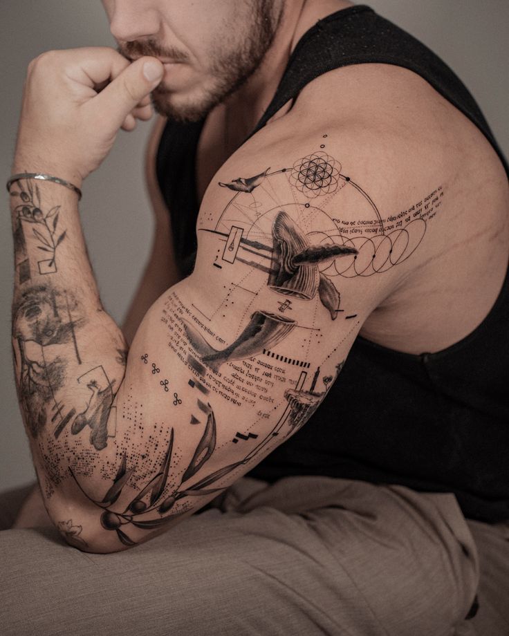
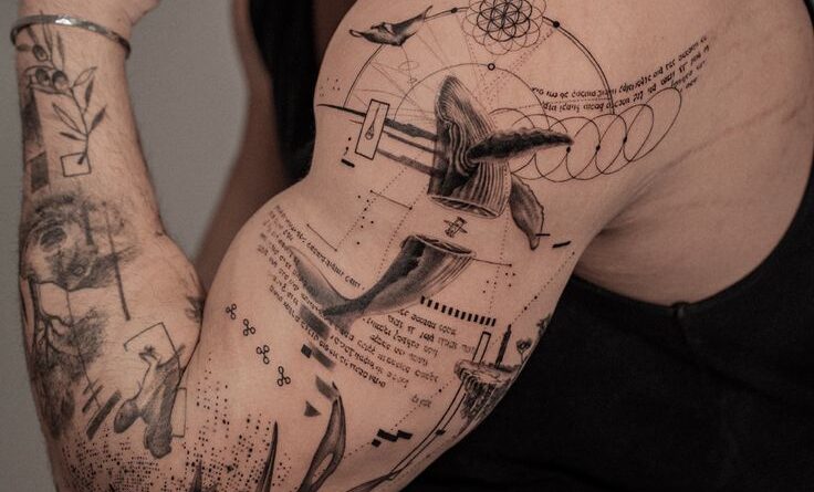
Graphic tattoos are defined by bold shapes, clean lines, and deliberate use of negative space. Unlike illustrative or painterly styles, graphic tattoos rely on visual hierarchy and strong contrast to remain readable at a distance and over time. Whether you are a tattoo artist or collector, understanding the interplay of silhouette, line weight, and body flow is essential for a successful design.
Readability: The First Rule of Graphic Tattoos
Readability means the tattoo can be understood at a glance. This is achieved through high contrast between ink and skin, clear outlines, and a simplified composition. Avoid fine details that will blur together as the tattoo ages. Instead, focus on bold silhouettes and distinct shapes. A good test: if you can’t recognize the design from three meters away, it needs more contrast and clarity.
Contrast: The Secret to Longevity
Contrast is not just black versus skin; it can be achieved with varying line weights, dotwork density, or color saturation. A common mistake is using too many mid-tones, which muddy the design. Plan your contrast zones: dark areas, light areas, and transitional gradients. For black-and-gray graphic tattoos, aim for at least three distinct shades: dark, mid, and light. For color, ensure hues are separated by at least two steps on the color wheel to avoid blending.
Composition Planning: Working with the Body
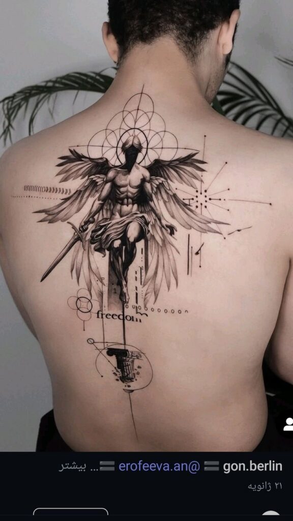
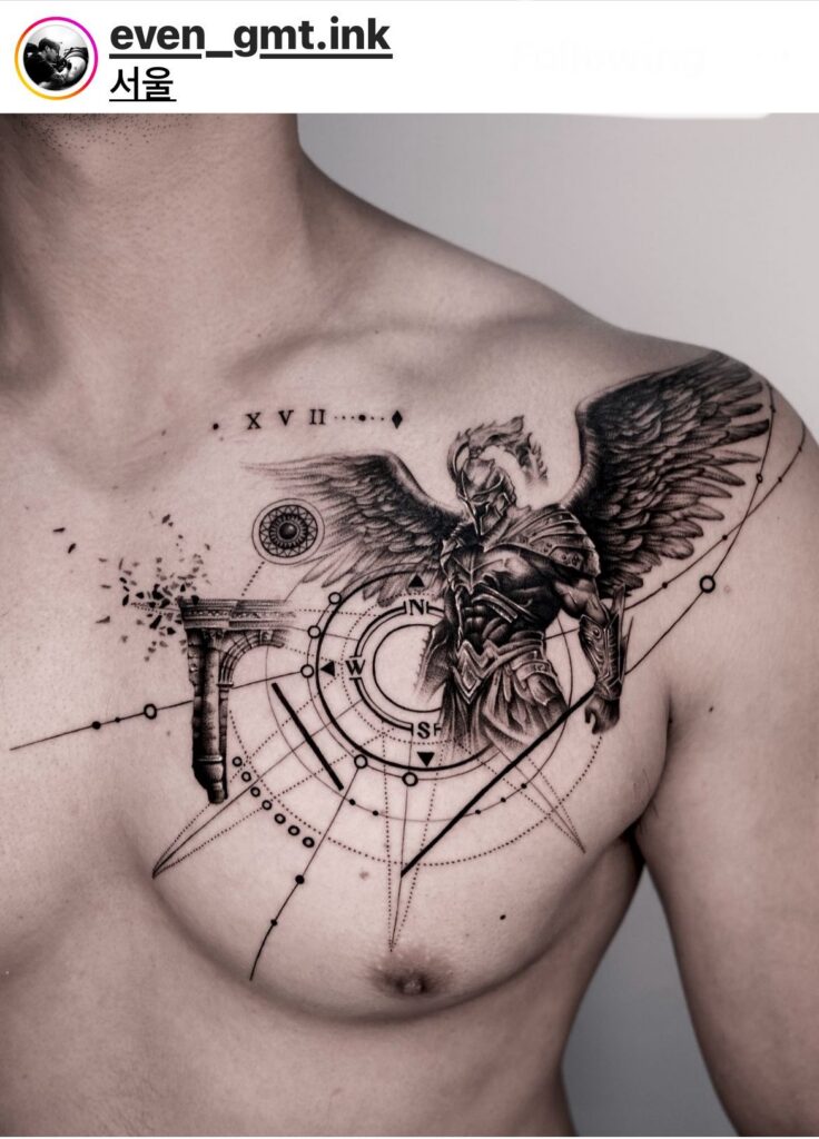
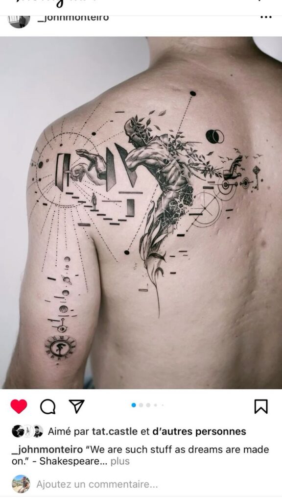
A graphic tattoo must respect the body’s curves and movement. Place focal points where the eye naturally travels, such as the center of a muscle belly or along a bone line. Use negative space to let the skin breathe and to create dynamic shapes. Always consider how the design will look from multiple angles—front, side, and in motion.
Silhouette and Negative Space
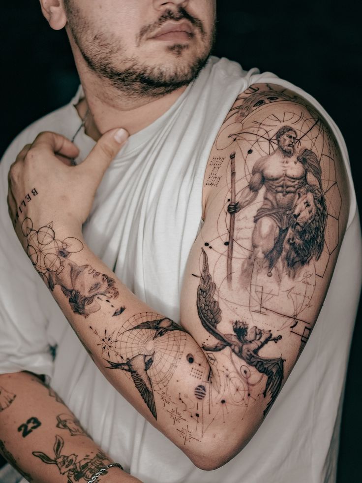
Silhouette is the overall shape of the tattoo, which should be readable from across the room. Negative space—the skin left untouched—is just as important as the ink. It defines the edges and creates optical illusions. For example, a geometric design might use negative space to form hidden images. When planning your silhouette, start with a solid outline and then carve out negative space to add complexity without sacrificing readability.
Checklist for Silhouette Success
- Outline the outer shape first; it should be simple and recognizable.
- Ensure the silhouette works even if all internal details were removed.
- Test the design at different sizes: does it still read well at 10 feet?
- Check that the negative space does not create unintended shapes or distractions.
Line Weight and Visual Hierarchy
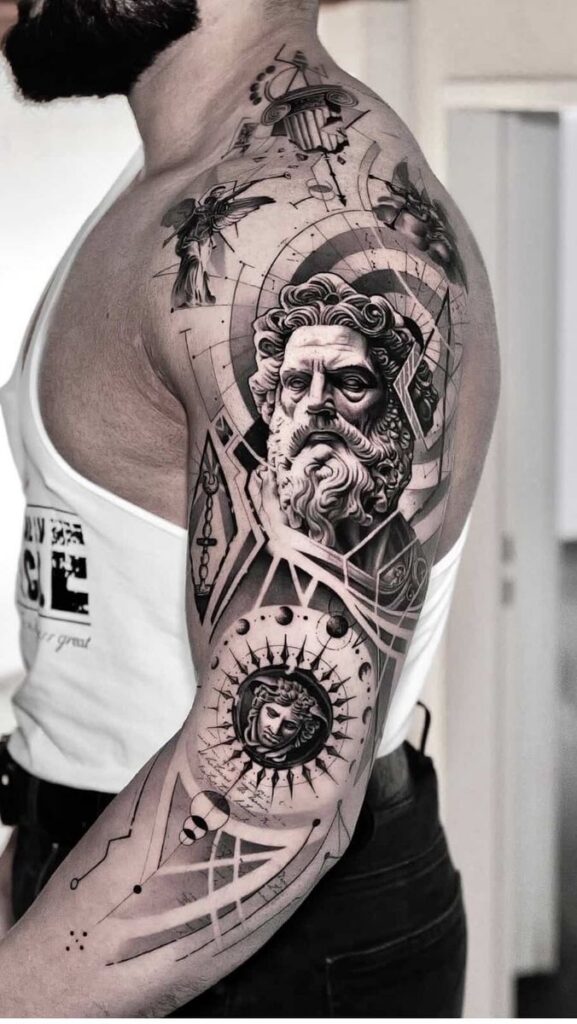
Line weight variation guides the viewer’s eye. Thick lines establish the main structure, medium lines add secondary forms, and thin lines provide texture. Avoid using the same weight everywhere—it creates a flat, unreadable mess. In graphic tattoos, the primary outline should be at least 3–5 times thicker than the finest detail lines.
How to Plan Line Weights
- Use a 7RL or 9RL for primary outlines.
- Use 3RL or 5RL for internal details.
- Use 1RL or 3RL for shading lines, keeping them sparse.
- Maintain consistent pressure to ensure uniform line quality.
Visual hierarchy means the most important element stands out first. For a graphic tattoo, that is usually the central motif. Background elements should be lighter or smaller. Use contrast in line weight to direct attention: the thickest lines should frame the focal point, while thinner lines recede.
Body Flow: Matching the Design to the Canvas
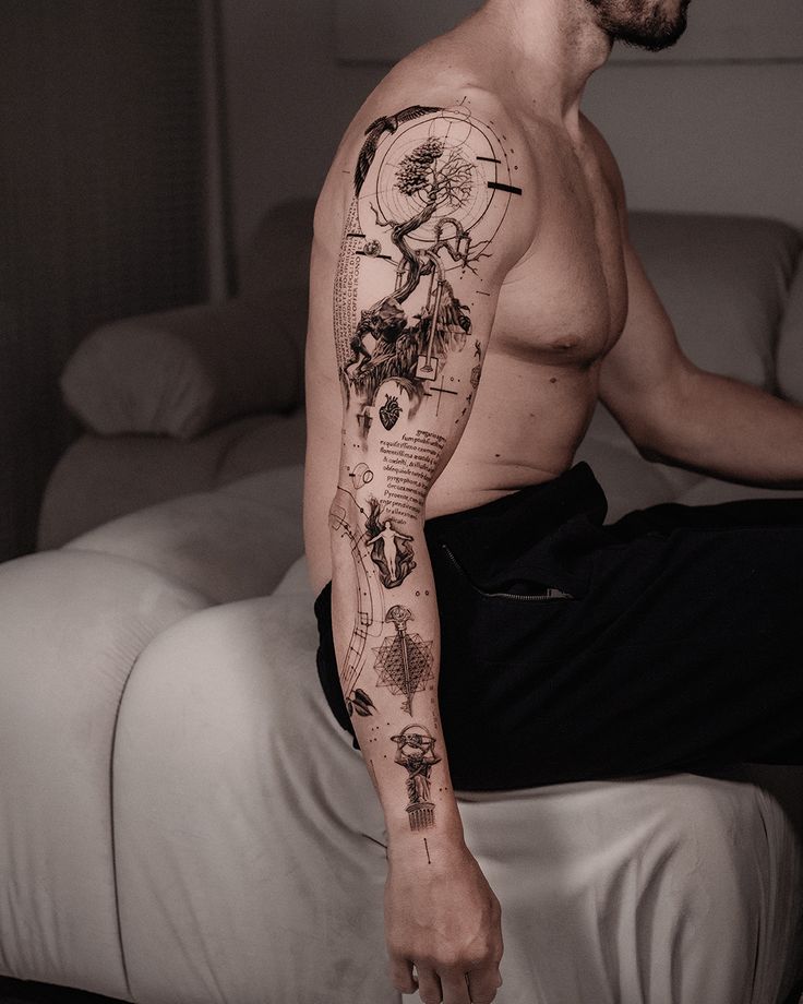
The human body is three-dimensional and moves. A graphic tattoo should follow the natural muscle lines and bone structure. For example, a series of parallel lines on a forearm should curve with the arm’s rotation. A static, straight design on a curved surface will look distorted. Study the placement area from multiple angles and ask the client to move during the design phase to see how the skin stretches and contracts.
Common Body Flow Mistakes
- Placing a perfectly symmetrical design on an asymmetrical body part (e.g., shoulder blade).
- Ignoring how the design wraps around the arm or leg.
- Using straight lines that clash with muscle curves.
- Not accounting for how the design will shift with weight gain or loss.
Step-by-Step Composition Planning
- Choose the placement – Consider visibility, pain tolerance, and how the design interacts with existing tattoos.
- Sketch the silhouette – Keep it simple; refine later.
- Add internal structure – Use line weight to create depth.
- Incorporate negative space – Let the skin show through in key areas.
- Check contrast – Ensure dark and light areas are balanced.
- Test readability – View the design from a distance and in different lighting.
- Adjust for body flow – Curve lines to match the body’s contours.
- Finalize stencil – Mirror the design for correct orientation.
Comparison: Graphic vs. Geometric vs. Abstract Tattoos
Graphic tattoos share similarities with geometric and abstract styles but have distinct differences. Graphic tattoos use bold shapes and high contrast, often with a clear message or symbol. Geometric tattoos rely on repeating patterns and symmetry. Abstract tattoos are non-representational and may lack a focal point. Choose based on your intent: graphic for impact, geometric for precision, abstract for emotion. For collectors, mixing these styles can create unique compositions, but ensure one style dominates to maintain coherence.
Real-World Examples and Caveats
A common caveat: graphic tattoos can look harsh if not softened with some shading or dotwork. Another: fine lines within a graphic design may fade quickly, so use them sparingly. Also, avoid placing graphic tattoos on areas that stretch a lot (e.g., stomach) as the design may distort. Always provide clients with realistic expectations about healing and longevity. For artists, practice on fake skin or fruit to perfect line weight consistency before working on clients.
FAQ
1. How long does a graphic tattoo last without touch-ups?
With proper aftercare and a skilled artist, a graphic tattoo can last decades. Bold lines hold up better than fine details. Expect touch-ups every 5–10 years for areas exposed to sun. Use sunscreen to prolong vibrancy.
2. Can graphic tattoos be done in color?
Yes, but color contrast must be carefully planned. Use solid blocks of color with clear separation. Avoid blending colors that are too similar. For example, pair a deep red with a pale yellow rather than two shades of orange.
3. What is the best body placement for a graphic tattoo?
Placements with flat, stable skin work best: upper back, chest, biceps, calves. Avoid joints or areas that move a lot. For smaller designs, the forearm or shin can work well.
4. How do I choose a graphic tattoo artist?
Look for portfolios with bold, clean lines and strong contrast. Check healed photos, not just fresh ones. Ask about their line weight consistency and experience with your chosen placement. Read reviews and visit the studio if possible.
For more inspiration, browse our tattoo rankings or find a studio near you. If you’re ready to book, use our consultation service to connect with top artists.
Content hub
Tattoo styles pillar
This article belongs to the styles cluster. Open the pillar page to compare Irezumi, Old School, Realistic, Blackwork, Fine line, Geometric and Watercolor.
Related reading
Continue reading
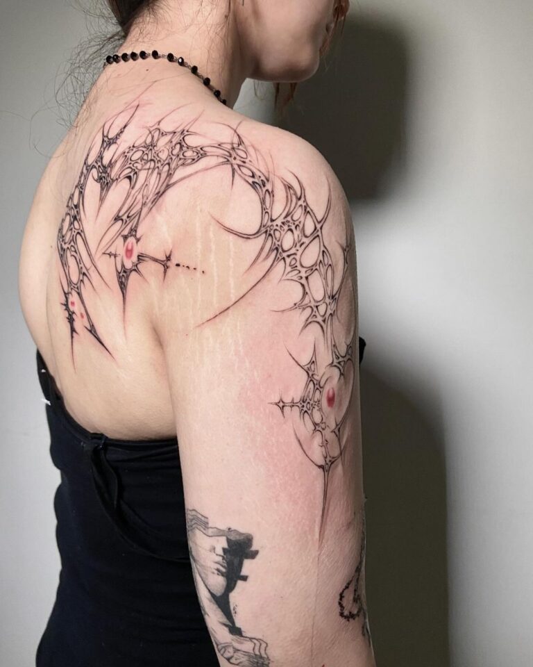
Cyber Sigilism Tattoo: Sharp Shapes, Symmetry, and Placement Limits
Discover the sharp shapes and symmetry of Cyber Sigilism tattoos. Learn about placement limits, design process, and aftercare…
Traditional vs Neo-Traditional Tattoo: Line, Color, and Healed Readability – A Professional Guide
Compare Traditional vs Neo-Traditional tattoo: line weight, color saturation, healed readability, and aging. Expert guide for choosing your…

Black and Grey Tattoo: Value Control, Soft Shading and Long-Term Contrast
Master black and grey tattooing with expert guidance on value control, soft shading techniques, and maintaining contrast over…