
Abstract Tattoo vs Graphic Tattoo: Composition Contrast & Readable Shapes
Understanding the Core Styles: Abstract Tattoo and Graphic Tattoo
Abstract Tattoo and Graphic Tattoo are two distinct approaches often mistakenly grouped together. Abstract Tattoo focuses on non-representational forms, using shapes, lines, and colors to evoke emotion or movement without a literal subject. Graphic Tattoo, conversely, draws from design principles—bold lines, flat colors, and high contrast—to create readable, illustrative imagery. The key difference lies in composition contrast and shape readability.
Composition Contrast: How Each Style Uses Visual Tension

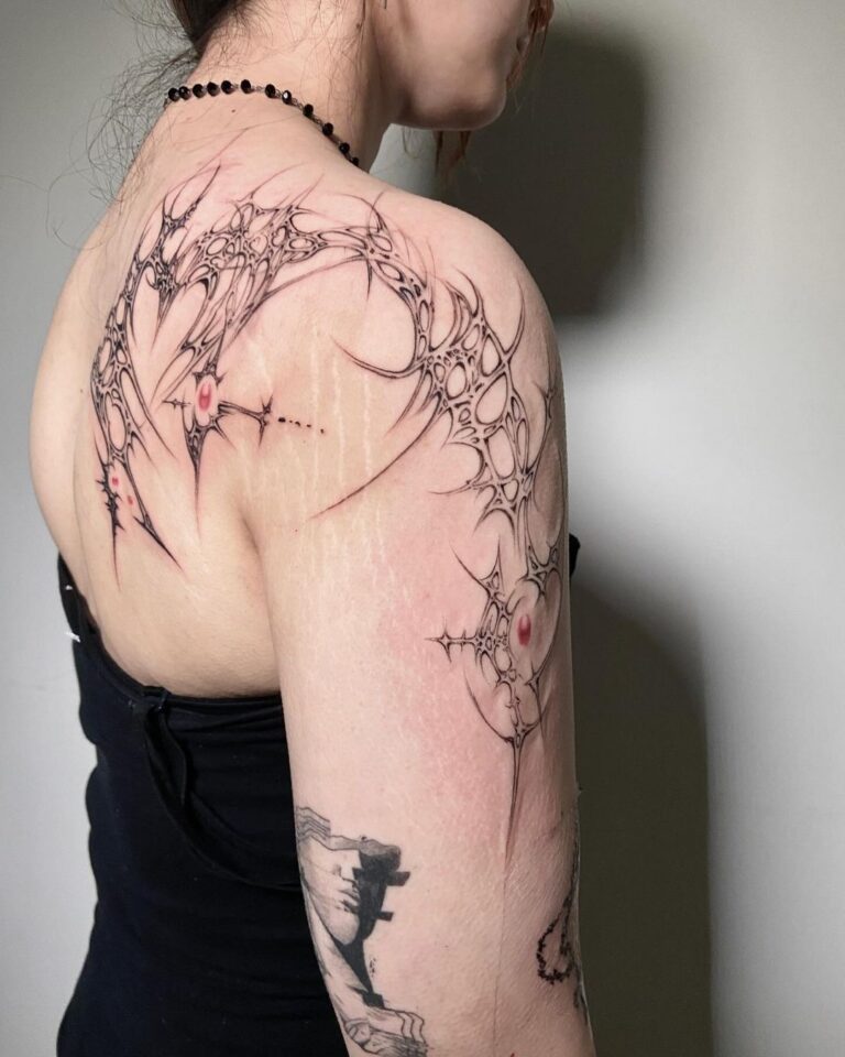
In Abstract Tattoo, contrast is often achieved through juxtaposition of organic versus geometric forms or through color field differences. The composition may feel chaotic but is intentional. Graphic Tattoo relies on sharp contrast between black and negative space, or between saturated colors, to make shapes pop. For example, a graphic tattoo might use a thick black outline against bare skin, while an abstract piece might blend soft gradients with hard edges.
Readable Shapes: Silhouette and Clarity
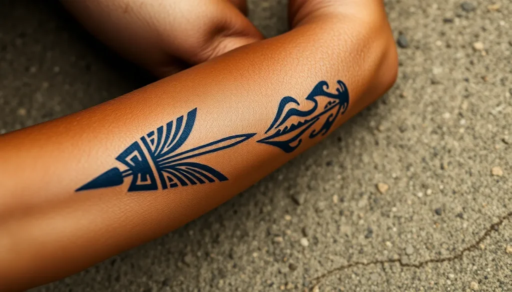
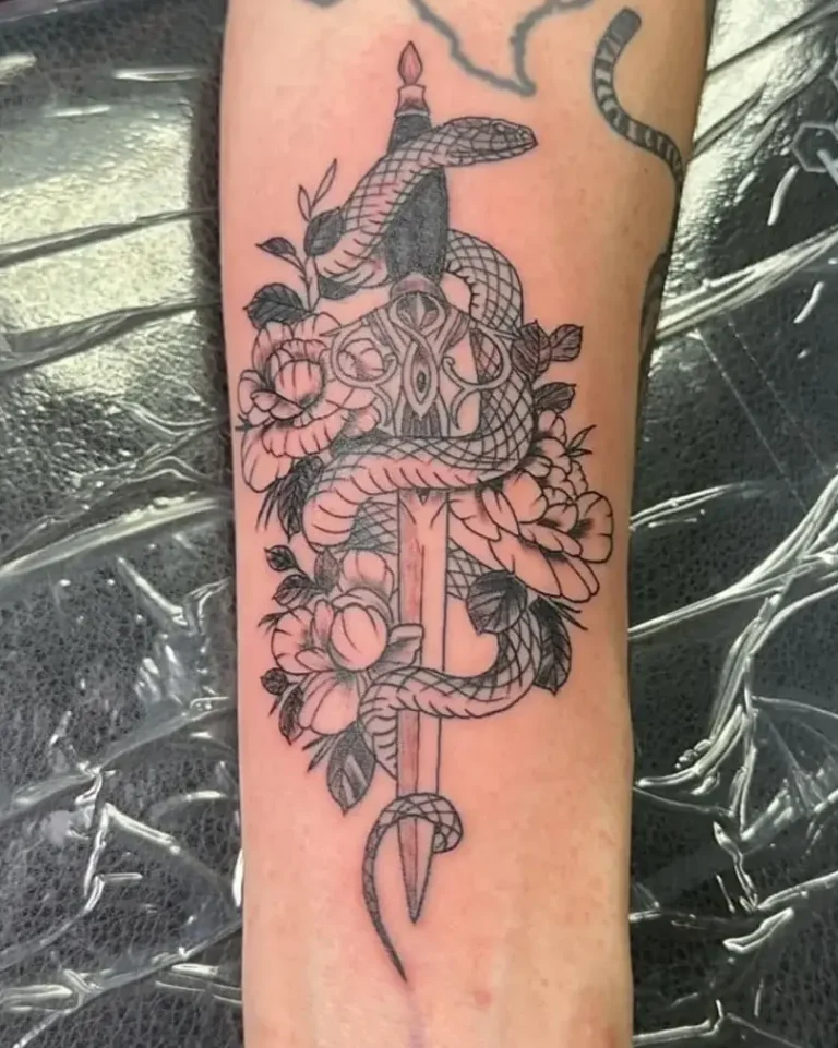
Graphic Tattoo prioritizes clear silhouettes—the design’s shape is instantly recognizable even from a distance. Abstract Tattoo may have ambiguous silhouettes, requiring closer inspection. When designing, consider how the tattoo will read at arm’s length. A graphic tattoo of a geometric animal head should be identifiable by its outline alone. An abstract tattoo might be a swirl of lines that only makes sense as a whole.
Skin Placement and Body Flow
Both styles must respect the body’s contours. Abstract designs often flow with muscle lines, using curves to enhance movement. Graphic designs can be more rigid, placed on flat areas like the chest or shoulder blade to maintain shape integrity. Avoid placing a highly detailed graphic piece on a highly mobile joint unless the design is flexible. For abstract, use the body’s natural lines as part of the composition.
Reference Boards: Curating Visual Inspiration
Create separate reference boards for each style. For Abstract Tattoo, include modern art, fluid dynamics, and texture studies. For Graphic Tattoo, collect logo designs, poster art, and tribal patterns. Avoid generic labels like ‘abstract’ or ‘graphic’; instead, use descriptors like ‘geometric abstraction with negative space’ or ‘bold line illustration with halftone dots.’ This helps clients communicate exactly what they want.
Avoiding Generic Labels: Speak the Language
Many clients say ‘I want something abstract’ but mean ‘I want a watercolor splash.’ Teach them the difference: Abstract Tattoo has no literal subject; it’s about form and color. Graphic Tattoo is design-driven, often with a clear subject rendered in a stylized way. Use terms like ‘non-objective’ versus ‘stylized representation.’ This sets accurate expectations.
Caveats and Practical Checks
Abstract tattoos can age poorly if contrast is too low—ensure enough dark ink to hold over time. Graphic tattoos with thin lines may blur; recommend bold lines for longevity. Always test a small area first if using light colors. For both styles, avoid placing on areas that stretch significantly unless the design can accommodate distortion.
FAQ
What is the main difference between Abstract Tattoo and Graphic Tattoo?
Abstract Tattoo is non-representational, focusing on emotion and form, while Graphic Tattoo is design-oriented with clear, readable shapes and high contrast.
Can I combine Abstract and Graphic elements in one tattoo?
Yes, many artists blend the two: a graphic outline with abstract fill, or an abstract composition with graphic linework. Ensure the contrast remains balanced.
Which style lasts better over time?
Graphic tattoos with bold lines tend to age better. Abstract tattoos with fine details or low contrast may need touch-ups sooner.
How do I choose between Abstract and Graphic for my first tattoo?
Consider your personal aesthetic. If you prefer clear, bold imagery, go Graphic. If you like fluid, interpretive art, choose Abstract. Consult with an artist who specializes in the style.
Read more
- Magazine for more tattoo knowledge, style guides and aftercare notes.
- Request a consultation if you need help with style, placement or preparation.
- Marketplace for equipment, supplies and learning resources.
Content hub
Tattoo styles pillar
This article belongs to the styles cluster. Open the pillar page to compare Irezumi, Old School, Realistic, Blackwork, Fine line, Geometric and Watercolor.
Related reading
Continue reading
Cyber Sigilism Tattoo: Sharp Shapes, Symmetry, and Placement Limits
Discover the sharp shapes and symmetry of Cyber Sigilism tattoos. Learn about placement limits, design process, and aftercare…
Traditional vs Neo-Traditional Tattoo: Line, Color, and Healed Readability – A Professional Guide
Compare Traditional vs Neo-Traditional tattoo: line weight, color saturation, healed readability, and aging. Expert guide for choosing your…
Black and Grey Tattoo: Value Control, Soft Shading and Long-Term Contrast
Master black and grey tattooing with expert guidance on value control, soft shading techniques, and maintaining contrast over…